
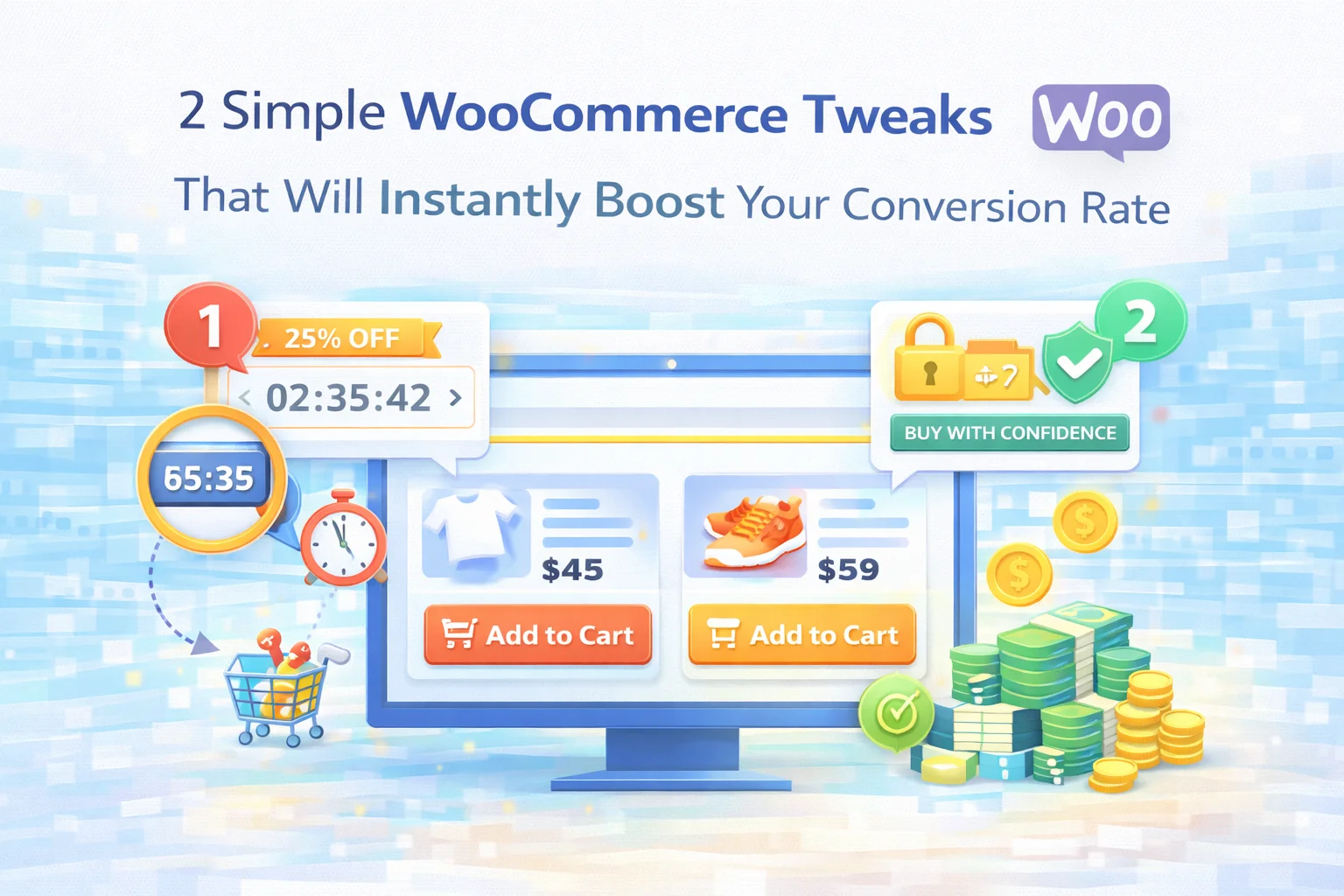
Most WooCommerce stores have a conversion rate problem that looks complicated from the outside but is surprisingly straightforward to diagnose once you understand the two most common failure points in the mobile shopping experience. Customers arrive, they browse, they show genuine interest — and then they leave without buying. Store owners respond by investing in ads, redesigning the homepage, or testing new product photography. Some of that helps. But it often misses the actual problem.
The actual problem, in the vast majority of cases, is friction at two specific moments: the moment a customer decides they want to buy something and can’t immediately find the button to do it, and the moment a customer is deciding how much to spend and has no visible incentive to add one more item to their cart. These two moments happen on nearly every product page, on every order, for every customer — and both can be fixed with targeted, lightweight tools rather than wholesale redesigns.
This guide covers both of those fixes in detail: what causes the problem, what the fix looks like in practice, and how to implement it in a way that actually works rather than just adding another element to your store’s interface.
The two tools involved are Sticky Add to Cart by NEXU WP and Nexu Free Shipping Bar by NEXU WP. Used individually, each one solves a real problem. Used together, they address the complete conversion gap that most WooCommerce stores are living with right now.
Why WooCommerce stores convert worse than they should
Before getting into the solutions, it is worth being precise about the problem. WooCommerce is a powerful platform, but its default product page structure was not designed around the two most important realities of modern online shopping: that most traffic is on mobile, and that the decision to buy is an impulsive moment that expires quickly.
On a desktop screen, a product page can show everything at once — the image, the price, the add to cart button, the description, and the reviews are all visible simultaneously, or accessible within a single scroll. On a phone, that same page is experienced as a vertical journey. A customer who reads your full product description and scrolls through your reviews has traveled quite far from the “Add to Cart” button that was at the top of the page. Their intent to buy is real — but the path to acting on it has become unnecessarily long.
At the same time, those same customers have no visible reason to spend more than they came planning to spend. If your free shipping policy is buried in a footer link, it is invisible to someone mid-browse on a product page. And invisible incentives do not change behavior.
The buy button disappearing on scroll is a friction problem — it adds an unnecessary step between intent and action. The invisible free shipping incentive is a motivation problem — it removes a natural reason to add more to the cart. Both hurt conversions, but they hurt in different ways and require different solutions. The good news is that both are fixable in under ten minutes with the right plugins.
Tweak #1 — Keep the buy button in reach, wherever the customer scrolls
Open any WooCommerce product page on your phone and scroll down past the first screen. Where is the “Add to Cart” button? It is gone — sitting back at the top of the page with the product image and price, invisible to anyone who has moved further down the page to read more. Now imagine a customer who has just finished reading your product description and decided they want to buy. They have to scroll back up, find the button, and complete the action. That backward scroll is not a big deal in isolation. But it is an interruption — a break in the momentum of a decision that was already made.
Purchase intent is fragile, especially on mobile where attention is split and distractions are everywhere. The customer might scroll back up and buy immediately. Or they might get distracted on the way back up, check a notification, put their phone down, and never return. The cost of that one extra scroll is not always visible in your analytics, but it is real.
Sticky Add to Cart: Mobile Floating Bar
Scroll-triggered · Context-aware · Variable product support · From $19/year
A sticky add to cart bar appears at the bottom of the screen the moment the original “Add to Cart” button scrolls out of view — and disappears again when the customer scrolls back to it. At all times, there is exactly one buy button visible: either the original one in the product summary, or the floating bar. They never compete. The bar simply ensures the purchase action is always within one tap, no matter how deep into the product page the customer has scrolled.
The bar can show product title, thumbnail, price, rating, and stock status — so customers always know what they are buying without scrolling back up. Variable products are handled intelligently: if a customer has not yet chosen a size or color, tapping the bar guides them to the selection form rather than triggering an error. The design panel lets you match colors, typography, and animation to your store’s visual language.

Tweak #2 — Make the free shipping incentive visible while customers are still deciding
The second conversion leak is subtler but equally costly: your free shipping policy exists, but your customers cannot see it at the moment when it would change their behavior. Most stores mention free shipping somewhere — in the footer, on the shipping policy page, or as a banner that appears at the top of every page in a static, easy-to-ignore format. None of these placements actually work, because they show the information as a fact rather than as a goal.
The behavioral difference between “Free shipping on orders over $50” and “You are $11 away from free shipping” is enormous. The first is a policy statement. The second is a live progress update toward a reward the customer is already partially earning. It creates a sense of investment — the customer has already put something in the cart, and they are most of the way to the goal. Completing it requires just one more small item. That framing is what drives the additional spend.
Nexu Free Shipping Bar: Multi-Zone Progress & Cart Booster
Real-time AJAX updates · Multi-zone thresholds · 6 display positions · From $29/year
A free shipping progress bar replaces the static policy statement with a live visual goal. When a customer adds a product, the bar advances. When they are close to the threshold, the remaining amount drops to a number that triggers the “one more item” instinct. When they reach the goal, the bar changes color and a congratulations message confirms the reward — right before they check out.
Nexu Free Shipping Bar takes this concept further than most plugins by supporting different thresholds per shipping zone — so domestic customers see a lower, more achievable goal while international customers see one that reflects actual shipping costs. The bar can appear on product pages, the cart, the mini-cart, the checkout, and as a site-wide header strip. It updates in real time via AJAX without page reloads, and auto-applies the free shipping rate in WooCommerce when the threshold is reached.

Why these two fixes work better together
Each of these tools solves a different problem, but they work on the same customer at the same time on the same page — and their combined effect is more significant than either one alone.
Think through a typical mobile product page visit with both tools active. A customer arrives, sees the product, sees the progress bar showing how close they are to free shipping. They read the description. They scroll down to the reviews. The original add to cart button has scrolled out of view — but the sticky bar is there at the bottom of the screen. They decide they want to buy and tap the bar. The product is added. The free shipping progress bar updates instantly: they are now $6 away. They browse one more product, add it, and the bar fills. They check out.
Without the sticky bar, the customer reaches their buying moment at the bottom of the page and has to scroll back up to act — introducing friction at the peak of their intent. Without the free shipping bar, they have no visible reason to add that second product — they buy only what they came for. With both tools active, the buying path is shorter and the average order is larger.
| Scenario | Conversion rate | Average order value |
|---|---|---|
| No sticky bar, no shipping bar | Baseline | Baseline |
| Sticky bar only | Improves ↑ | Unchanged |
| Free shipping bar only | Marginal ↑ | Improves ↑ |
| Both tools active | Improves ↑↑ | Improves ↑↑ |
The sticky bar fixes the friction problem (customers who decided to buy but could not easily act). The free shipping bar fixes the motivation problem (customers who bought only what they planned to buy). Together they close both gaps simultaneously.
What implementation actually looks like
Both plugins install and activate like any standard WordPress plugin — no custom development, no theme modifications, no external integrations. The configuration is done entirely from the WordPress admin.
Install Sticky Add to Cart, open the general settings tab, and choose which devices you want the bar active on — mobile only is the typical starting point since that is where the scroll friction problem is most acute. Select which product elements to show in the bar (title, price, rating, stock are recommended). Open the design tab and match the bar’s color and typography to your theme. Done. The bar will activate automatically on all WooCommerce product pages when the original buy button scrolls out of view.
Install Nexu Free Shipping Bar, set your threshold amount in the general tab (a practical starting point is your current average order value plus 20–25%), enable the display positions you want (product page and cart at minimum), customize the progress, completion, and empty-cart messages in the messages tab, and adjust colors in the appearance tab to match your store. If you ship to multiple regions with different costs, use the condition builder to set zone-specific thresholds. The whole setup takes under ten minutes for a straightforward configuration.

One honest caveat about “instant” improvements
The word “instantly” in this article’s title deserves a moment of honesty. Both plugins activate immediately and begin working on your first customer visit after setup. The changes they make to the shopping experience are real and measurable. But “instant” in the context of conversion optimization means that the mechanism is active immediately — not that you will see dramatic numbers in your analytics on day one.
Depending on your traffic volume, it may take a few days or a couple of weeks to accumulate enough data to see the impact clearly in your conversion reports. On a high-traffic store, you can see meaningful movement in average order value and conversion rate within 48–72 hours. On a lower-traffic store, give it two to three weeks before drawing conclusions.
What is genuinely immediate is the improvement to the shopping experience itself. Every customer who visits your product page from the moment these tools are active will encounter a smoother, better-motivated path to purchase. The cumulative effect of that improvement is what shows up in your analytics — and it builds with every transaction.
Frequently asked questions
Most WooCommerce conversion problems do not require a full redesign. They require identifying the two or three specific moments where customers are falling out of the purchase flow and fixing those moments with targeted solutions. A sticky add to cart bar that keeps the buy button accessible at any scroll depth, and a free shipping progress bar that makes the incentive to spend more visible in real time — these are the two most consistently impactful changes you can make to a WooCommerce product page without touching a line of code.
Both are available now from NEXU WP: Sticky Add to Cart: Mobile Floating Bar & Conversion Booster and Nexu Free Shipping Bar: Multi-Zone Progress & Cart Booster.
Fix both conversion gaps — sticky buy button and free shipping motivation
Both plugins install in minutes, require no code, and start working on your first customer visit. Together from $48/year for a single WooCommerce store.





Didn't expect such a quick fix to actually make a difference, but that sticky "Add to Cart" tweak really worked. before, customers kept scrolling right past the button, and now it's right there when they're ready to buy. No full redesign needed just a small but smart adjustment. Still, totally worth it for the conversion boost we're seeing
Hey, this actually works! No more missed sales
Hey, what's up with this? Said it was two quick tweaks, but the guide's 9 minutes long?