
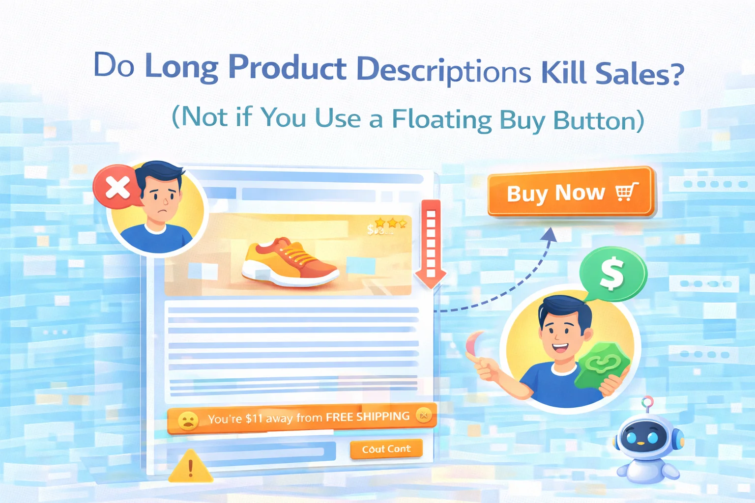
There is a debate that surfaces regularly in ecommerce optimization circles: should product descriptions be short and scannable, or long and comprehensive? The short-description camp argues that attention spans are limited, customers are impatient, and every extra line of text is another obstacle between intent and purchase. The long-description camp argues that customers who are genuinely deciding whether to buy need information, that thin descriptions create doubt, and that comprehensive content is also better for SEO.
Both camps are half right. And both are solving the wrong problem. The actual question is not how long your product description should be. The actual question is: when a customer finishes reading your product description and decides they want to buy, can they find the buy button immediately? If the answer is no — if the add to cart button has scrolled off the screen by the time they reach the end of your copy — you have a conversion problem that has nothing to do with description length and everything to do with purchase accessibility.
This is the problem that a floating buy button for WooCommerce solves — and solving it changes the whole calculus of how you write product descriptions, because you are no longer forced to choose between informative content and an accessible purchase action.
The actual reason long descriptions lose sales — and it is not information overload
When someone says a long product description is killing conversions, they are usually pointing at the wrong variable. Information does not repel buyers — uncertainty does. A customer who reads a long description and comes away with a clear picture of what they are buying, why it suits their need, and what it costs in total is a well-informed buyer who is more likely to convert, not less. The customer who abandons is not the one who read too much. It is the one who read enough to decide they wanted to buy, scrolled to the end, found no buy button in sight, and lost the moment.
That moment — the moment of purchase intent — is fragile and brief. It does not wait while the customer scrolls back up through a long page to find the add to cart button. Customers in that moment are acting on a decision they just made. Any friction between the decision and the action is a friction that causes abandonment. The friction is not the length of the description. The friction is the absence of a purchase mechanism at the point where the decision was made.
Eye-tracking and scroll depth studies of ecommerce product pages consistently show that customers read in a non-linear pattern — they scan, jump to specific sections, re-read certain passages, and form their purchase decision at different scroll depths depending on the product category and their prior familiarity with the product. A customer buying a commodity item might decide within the first few seconds. A customer buying a complex technical product might read the entire page twice before deciding. The buy button needs to be accessible at every point in that journey, not just at the top.
This is particularly acute on mobile. On a desktop screen, a well-designed product page can keep the add to cart button visible in a sticky sidebar column while the customer reads the description in the main column. That layout is simply not available on a single-column mobile page. On mobile, the add to cart button is in the product summary section at the top. The description is below it. As soon as the customer starts reading, the button is gone. The longer the description, the more scrolling required to reach the end — and the further away the button is when the decision gets made.
Long descriptions are actually better for conversion — when the buy button stays accessible
The ecommerce evidence on description length and conversion is more nuanced than the “short is better” conventional wisdom suggests. Product categories with higher perceived risk — electronics, health products, technical equipment, high-price items — consistently show higher conversion rates with more comprehensive descriptions, not shorter ones. Customers who are spending more money, or who are uncertain about whether a product is right for their specific situation, need information to make a confident decision.
Thin descriptions on high-consideration products do not simplify the decision — they defer it. The customer who cannot find the answer to their question on your product page goes looking for it elsewhere — a competitor’s page, a review site, a YouTube video. Some of those customers come back. Many do not. A comprehensive description that answers the questions customers are actually asking keeps them on the page and in the buying mindset rather than sending them into a research detour from which they may not return.
There is also the SEO dimension. Product descriptions are among the most important on-page content signals for ranking in product-specific search queries. A thin description gives Google very little to work with. A comprehensive description that covers the product’s features, use cases, benefits, and specifications in natural language gives Google multiple keyword signals to rank the page for a wider range of relevant searches. Cutting descriptions short to accommodate a concern about buy button accessibility is sacrificing SEO value for a problem that can be solved a different way.
Buy button stays visible longer. But customers who need more information leave to find it elsewhere. SEO signals are thin. High-consideration buyers are underserved. The problem is solved by removing content that was doing a job.
Comprehensive content answers every question. SEO signals are rich. The buy button follows the customer everywhere on the page. Purchase intent can convert wherever it forms — even at the very end of a long description.
What a floating buy button actually does on a long product page
A floating buy button — or sticky add to cart bar — is a strip that appears at the bottom (or top) of the screen once the original add to cart button scrolls out of view. It contains the purchase action the customer needs, along with enough product context to confirm they are buying the right thing without having to scroll back up.
The behavior that matters most is the trigger: the bar appears when the original button is no longer visible, and disappears again when the customer scrolls back up and the original button comes back into view. This means it is present exactly when it is needed — when the customer is in the page content and the purchase action is not in view — and absent when it is not needed, which prevents it from feeling like a persistent intrusion on the page design.

The content of the bar is the second important design decision. A floating bar that shows only a button — with no product context — forces the customer to remember what they were looking at if they have been reading for a while. A bar that shows the product title, thumbnail, price, star rating, and stock status gives the customer full context for the purchase without requiring any scrolling. When a customer reaches the end of a 600-word product description and sees the floating bar, they should be able to act on their decision immediately without any additional mental work.
Sticky Add to Cart: Mobile Floating Bar Conversion Booster for WooCommerce by NEXU WP shows product thumbnail, title, price, rating, and stock status in the bar. It is fully configurable — you control which elements appear, how the bar is styled, what animation it uses, and whether it appears on mobile, desktop, or both. And it handles variable products correctly: if the customer has not yet selected their size or color, the bar guides them to the selection form rather than displaying an error.
What to put in a long product description that actually earns its length
With the floating button solving the accessibility problem, there is no longer a penalty for writing the description your product actually needs. But length for its own sake does not help anyone. Here is what earns every additional paragraph in a product description.
Every product has a set of common objections — concerns that make customers hesitate before buying. Sizing uncertainty. Compatibility questions. Durability doubts. Material or ingredient concerns. If you know what those objections are (and you can find out from customer service emails, reviews, and chat logs), addressing them in the description keeps customers on the page instead of searching for answers elsewhere. Each addressed objection is a paragraph that earns its place.
Describing who the product is for — and equally, who it is not for — helps customers self-qualify and builds trust. A customer who reads “This is the right choice if you need X, Y, Z. If you need W, consider our [alternative] instead” feels treated honestly rather than sold to. That honesty creates the kind of confidence that converts into purchases, returns, and repeat orders.
Exact dimensions. Precise weight. Material composition. Compatibility specifications. Care instructions. These details seem dry, but for a customer on the verge of buying they are the last pieces of certainty that close the gap between “I think I want this” and “I am definitely buying this.” A specifications section at the end of the description serves the detail-oriented buyer without slowing down the scanner who skips it.
A longer description naturally contains more keyword signals. But the SEO value only materializes if those keywords appear naturally in content that is actually useful — search engines have become very good at distinguishing keyword-stuffed descriptions from content that genuinely answers questions. Write for the customer, answer real questions, and the SEO follows. Write for the keyword count, and neither the customer nor the search engine is well-served.
The product categories where a floating buy button has the most impact
While a floating buy button improves accessibility on any WooCommerce product page with content below the fold, the conversion impact is not equal across all product types. These are the categories where the combination of long descriptions and a floating buy button makes the most measurable difference.
| Product category | Why description length matters here | Floating bar impact |
|---|---|---|
| Electronics & tech | Customers need specs, compatibility details, and comparison context before deciding | Very high |
| Health & supplements | Ingredient lists, usage instructions, and suitability guidance drive purchase confidence | Very high |
| Home & furniture | Dimensions, materials, assembly requirements, and care instructions are essential | Very high |
| Fashion & apparel | Sizing guidance, fabric details, and fit notes reduce returns and increase first-purchase confidence | High |
| Software & digital | Feature breakdowns, system requirements, and use-case scenarios close the sale | High |
| Commodity / repeat purchase | Customers already know what they want — short descriptions are appropriate here | Lower |
The one category where long descriptions are genuinely less valuable is repeat commodity purchases — where the customer knows exactly what they want and just needs to find the buy button quickly. Interestingly, a floating buy button is also most useful here, just for a different reason: the customer does not need to read at all, and a persistent buy button means they never have to scroll to the product summary to act on their immediate intent.
Configuring the floating buy button for a long-description product page
If you are running WooCommerce and you have products with substantial descriptions, the configuration decisions for the floating bar are straightforward. The key settings to get right are trigger behavior, bar content, and variable product handling.

Set the bar to appear when the original add to cart button scrolls out of the viewport, not after a fixed time delay. Time-based triggers show the bar to customers who are still reading the top of the page and have not needed it yet — which feels intrusive. Scroll-based triggers show it only when the button has actually disappeared, which is exactly when it is needed.
Enable the product thumbnail, title, price, and rating in the bar. On a long description page, by the time the customer reaches the end they have been reading for thirty seconds or more — showing them what they are adding to cart provides reassurance that they are acting on the right product, especially on pages where the product title and image are now well off the screen above.
For products with size, color, or other variation selectors, configure the bar to scroll the customer smoothly to the variation selector when they tap the button before making a selection — rather than showing an error. On a long product page, the variation selector may itself be off-screen when the customer taps the floating bar. A smooth scroll-to-selection guides the customer through the step without breaking the flow.
Frequently asked questions
The debate between short and long product descriptions has always been a false binary. The real question is whether your product page gives customers both the information they need to decide and an easy path to act on that decision the moment they have made it. Long descriptions answer the first requirement. A floating buy button answers the second.
Sticky Add to Cart: Mobile Floating Bar Conversion Booster for WooCommerce gives you the second requirement for $19 per year — so you can stop choosing between content that converts and an accessible buy button, and start offering both on every product page.
Write the description your product needs. The buy button will follow.
Scroll-triggered. Context-rich bar with product image, title, price, rating, and stock. Variable product support. Full design control. Mobile and desktop. From $19/year.






Ugh, where'd the buy button go?
I bought this during the summer sale hoping it would keep the "Add to Cart" button visible while customers scroll through long descriptions. setup was straightforward, but I'm still not sure if it's actually helping conversions. The floating button works fine on desktop, but on mobile, it sometimes covers part of the text, which might be worse than losing the button entirely. For an accountant running a side ecommerce store, that's a worry will customers get frustrated and bounce? maybe I'm missing something.
As an RN running a side shop, I don't have time to test every little thing