
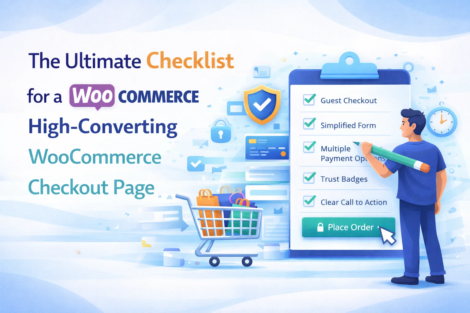
There are dozens of articles about checkout optimization. Most of them give you general advice: “make your checkout fast,” “reduce friction,” “build trust.” That advice is directionally correct but it is not actionable. You cannot deploy “reduce friction” as a task. What you can do is go through a concrete checklist of specific items, evaluate each one against your actual checkout page, and fix the ones that are falling short.
That is what this guide is. A checklist with 30 specific, verifiable items organized into six categories: form fields, page speed, trust and security, layout and design, mobile experience, and data collection. Each item is something you can check right now on your WooCommerce checkout page, and each one has a direct impact on whether a customer completes their order or abandons it.
Several items in this checklist relate directly to how your checkout fields are configured. For those items, a WooCommerce checkout field editor with drag-and-drop, conditional logic, and field management is the tool that lets you implement the fix quickly.
Category 1: Form fields
Your checkout form is where most friction lives. These items address the number, type, and configuration of fields on your checkout page.
Go through each field on your checkout form and ask: “Do I need this information to process and deliver this order?” If the answer is no, disable it. Common offenders are “Company Name” on B2C stores, “Address Line 2” when your customers rarely have suite numbers, and “Phone” when you do not use phone-based delivery coordination.
The email address is the most valuable data point for cart recovery. Move it to the very top of the billing section so you capture it even if the customer abandons the rest of the form. This single reorder can meaningfully increase your recovered revenue from abandoned cart emails.
Ambiguity about whether a field is required causes hesitation. When a customer does not know if they can skip a field, they pause. That pause is a micro-abandonment risk. Add “(optional)” to the label of every non-required field.
If a field is only relevant under certain conditions (gift orders, local delivery, business accounts), it should only appear when those conditions are met. Showing all possible fields to all customers makes the form look longer and more complex than it needs to be for any individual transaction.
If your store sells products that require custom data (engraving text, measurements, dietary preferences), those fields should appear only when those specific products are in the cart. A checkout field editor with per-product fields lets you assign unique fields directly to individual products.
Replace generic labels with language that matches your brand tone. “Street Address” is functional. “Where should we deliver?” is warmer. Add placeholder text that shows the expected format (“e.g., Apartment 4B”) to reduce errors and guide customer input.
Date selections use date pickers, not text fields. Multiple-choice questions use dropdowns or radio buttons. Boolean choices use checkboxes. Smart field types are faster to fill in, prevent format errors, and return clean, consistent data that your team can process without interpretation.

Category 2: Page speed
A slow checkout page kills conversions. Customers who have already decided to buy should not be waiting for scripts to load. According to Cloudflare’s research, a 1-second improvement in page load time can increase conversions by up to 2%.
Test your checkout page speed with Google PageSpeed Insights or GTmetrix. If it takes more than 3 seconds to become interactive, diagnose and fix the bottleneck. Common culprits are unoptimized images, too many external scripts, and plugins that load unnecessary resources on the checkout page.
Many plugins load their CSS and JavaScript on every page, including checkout. Use a plugin like Asset CleanUp or Perfmatters to selectively disable scripts that are not needed on the checkout page. Your social sharing buttons, slider plugins, and popup builders should not be loading anything on checkout.
Page caching speeds up most of your site, but the checkout page should be excluded from caching because it contains dynamic, session-specific data (cart contents, user information, CSRF tokens). Most caching plugins exclude WooCommerce checkout automatically, but verify this is configured correctly.
When a customer changes their country, state, or shipping method, WooCommerce makes AJAX requests to update available options and totals. These updates should happen quickly and smoothly. If there is visible lag or the page jumps during updates, investigate your server response time and the number of plugins hooking into the checkout update process.
Category 3: Trust and security
Customers are about to give you their credit card number. They need to feel confident that your checkout is secure and that your business is legitimate. These items address the trust signals that influence that confidence.
This is non-negotiable. Your checkout page must load over HTTPS with a valid SSL certificate. Most browsers now show security warnings for non-HTTPS pages, and payment processors require it. Check that the padlock icon appears in the browser address bar on your checkout page.
Visa, Mastercard, PayPal, Apple Pay logos tell the customer instantly that you accept their preferred payment method. This reduces the anxiety of “will my card work here?” and the abandonment that follows when a customer is unsure.
A link to your return or refund policy visible on the checkout page gives hesitant buyers the reassurance they need. “What if it does not fit?” or “What if it is not what I expected?” are questions that stop orders. A visible refund policy answers them without the customer leaving checkout to find it.
Unexpected shipping fees, taxes, or surcharges that appear for the first time at checkout are the number one reason for cart abandonment according to the Baymard Institute. Show shipping costs as early as possible in the shopping journey, ideally on the product page or in the cart.
Forcing account creation at checkout is a well-documented conversion killer. Offer guest checkout and let customers create an account after their order is placed. WooCommerce has a setting for this under WooCommerce > Settings > Accounts & Privacy. Make sure “Allow customers to place orders without an account” is enabled.
Category 4: Layout and design
The checkout page should focus the customer on completing the purchase. Header navigation menus, sidebar widgets, and footer links give the customer exit routes. Many high-converting stores use a simplified checkout header with just the logo and a “Back to Cart” link.
The customer should be able to see what they are buying, including product names, quantities, images, and the total price, at every point during checkout. If the order summary is hidden or only visible at the bottom after scrolling past the entire form, you are asking customers to confirm a purchase they cannot see.
Your submit button should be large enough to find instantly, use a contrasting color from the rest of the page, and use clear action language. “Place Order” or “Complete Purchase” work. “Submit” is vague. “Process” is ambiguous. The button should tell the customer exactly what clicking it will do.
When validation fails, the error message should appear next to the field that caused the error, not in a block at the top of the page that requires scrolling to find the problem. Inline validation that shows errors as the customer fills in each field is even better.
Category 5: Mobile experience
Browser DevTools mobile emulation is not enough. Open your checkout page on a real phone and try to complete an order. Feel the tiny tap targets, notice the keyboard covering half the screen, experience the scrolling that goes on forever when you have too many fields. This exercise reveals friction that no desktop test can show.
Email fields should trigger the email keyboard (with @ and .com shortcuts). Phone fields should trigger the numeric keypad. Postal code fields should trigger the numeric keyboard where appropriate. The correct keyboard type makes input faster and reduces errors on mobile.
Apple’s Human Interface Guidelines recommend a minimum touch target of 44×44 points. Checkboxes, radio buttons, dropdown arrows, and the submit button all need to be large enough to tap accurately with a finger. Tiny form elements cause mis-taps, frustration, and abandonment on mobile.
Mobile wallet payment methods let customers pay with a single tap or face scan. They skip the entire card number, expiration date, and CVV entry process. Enabling Apple Pay and Google Pay via your payment gateway can dramatically improve mobile checkout completion rates.
Category 6: Data collection and recovery
If you have not set up abandoned cart recovery emails, you are leaving money on the table. A well-timed follow-up email sent 1 to 3 hours after abandonment can recover 5 to 15% of lost carts. This item works hand-in-hand with item 2 (email at the top of the form), because you can only email customers whose email you captured.
If you have added custom checkout fields, verify that the data customers enter actually appears in the order confirmation email and in the admin order detail page. Custom data that is collected but not displayed is useless. Place a test order with custom field data and check every touchpoint.
If you have spent time configuring checkout fields, conditional logic, and per-product fields, protect that work. Export your entire checkout field configuration to a JSON file and store it somewhere safe. If a plugin update or site migration disrupts your checkout, you can restore the configuration in seconds.
WooCommerce is migrating to the Blocks-based checkout as the default. If your store uses or will use the Blocks checkout, verify that your checkout field editor, payment gateways, and any other checkout-related plugins all work correctly with it. Test on a staging site before switching.
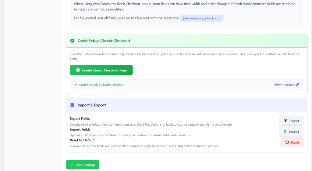
This checklist is not something you go through once and forget. Revisit it quarterly, after every major WooCommerce update, and whenever you add new products or shipping methods. Your checkout page is a living system that needs ongoing attention to keep converting at its best.
The field-related items on this checklist (items 1 through 7, plus 26 through 28) are all manageable through a single tool. The NEXU WooCommerce checkout field editor with conditional logic, per-product fields, and configuration export covers field removal, reordering, conditional display, per-product assignment, data flow to emails and admin, and configuration backup. That is 10 of the 28 items on this checklist addressed by a single plugin.
Check off 10 conversion items with a single checkout field editor
Remove unnecessary fields, reorder for recovery, add conditional logic, assign per-product fields, verify data flow, and back up your configuration. All from one visual interface.





Got the checklist and it's actually really solid for spotting issues. The form field section was super useful I finally labeled my optional fields the right way. Only downside is half the page speed fixes need dev work or plugins, and I just don't have time for that right now. Would've loved more no code quick wins in there
Saved me so much time setting up.
This checklist saved me so much time during our charity drive's online store setup. The form fields section was a lifesaver we had no idea how much unnecessary info we were asking for until we went through it. Cutting down the fields boosted donations by 12% in a week. Only reason it's not 5 stars is because some of the technical tweaks (like conditional logic) took a bit of Googling to figure out, but still worth every penny.
This checklist saved me hours of guessing got my form fields fixed in 10 minutes flat.