
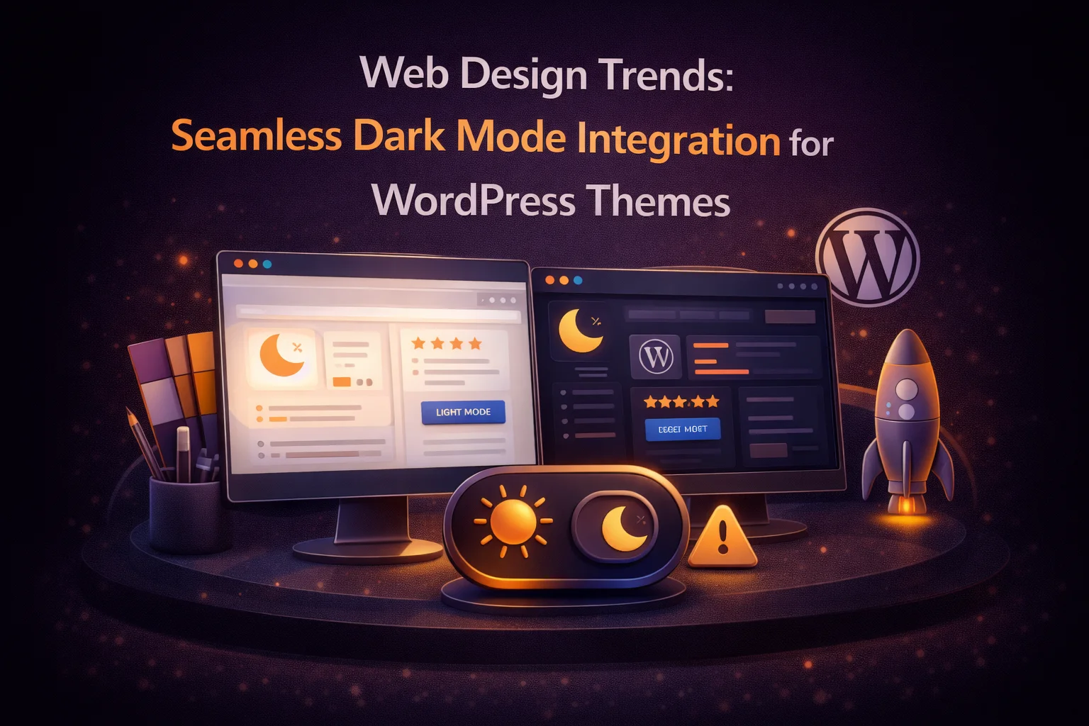
Something shifted in how designers and developers think about dark mode somewhere around 2023, and by 2026 that shift is fully established: dark mode is no longer a technical feature you add to a site. It is a design layer that either belongs to the site’s visual identity or it does not. The sites that do it well — the ones that feel genuinely premium, considered, and intentional — treat dark mode as a parallel design system rather than an afterthought applied over their existing theme.
The word “seamless” in the context of dark mode has a specific meaning that goes beyond just the absence of a white flash. A seamless dark mode is one the user does not have to consciously notice or think about. It is there when they need it, it matches their OS preference automatically, it switches without visual disruption, and the dark version of the site feels as designed and intentional as the light version — not like a dark filter applied on top of something designed only for light.
This guide covers the design principles, technical requirements, and aesthetic choices that separate seamless dark mode from the typical implementation. We look at what the current trends in WordPress theme design say about dark mode, how those trends translate into specific configuration decisions, and how the right tooling makes it achievable without building a custom dark theme from scratch. The reference implementation throughout is Nexu Eclipse — the WordPress dark mode plugin designed for seamless, design-forward integration.
Whether you are a designer building a new WordPress site in 2026 or a developer retrofitting dark mode onto an existing theme, this is the guide for approaching it as a design decision rather than a checkbox.
Dark mode in 2026: from developer preference to design expectation
The trajectory of dark mode as a web design feature follows a pattern familiar from other UX capabilities that started as niche preferences and became baseline expectations. Responsive design followed this path. Mobile-first design followed it. Dark mode is at the end of that arc in 2026 — it is no longer a feature that impresses users; it is an absence that disappoints them.
The data points are consistent: over 80 percent of smartphone users prefer dark mode for evening use, macOS and Windows both default to automatic dark mode switching based on time of day for new users, and OLED screens — which make up the majority of current flagship devices — actively conserve battery when displaying dark content. Dark mode has moved from enthusiast territory into the expectation of the median smartphone user.
What this means for WordPress designers in 2026 is that dark mode cannot be the visual afterthought it was in 2020. Users encountering a site in dark mode on their device now have an implicit expectation that the site will honor their preference — and when a well-designed site does so with a polished, seamless implementation, the quality perception uplift is significant. When a site does it poorly — flashing white, inverting images, losing visual hierarchy — the quality perception damage is equally significant.
The four principles of seamless dark mode
Seamless is not a single property — it is the combination of four qualities that, when all present together, make dark mode feel like an intrinsic part of the site rather than a feature overlaid on it.
A dark mode that flashes white before applying is not seamless by definition. The absence of FOUC is the technical prerequisite for all the design work that follows. You cannot create a seamless dark mode experience on top of a flash. The rendering timing has to be solved first — via a synchronous inline head script and OS-level CSS detection — before any of the aesthetic decisions matter. This is not a design principle; it is the engineering foundation that makes the design principles achievable.
When a user switches from light to dark, they should immediately recognize they are still on the same site. The typography, the layout, the hierarchy, the brand accent colors — all of it should be recognizable in its dark form. This requires designing the dark palette as a deliberate translation of the light palette, not an arbitrary set of greys. Your primary accent color in light mode should have a specific dark mode equivalent that maintains its brand meaning. Your heading hierarchy should be as clear at a glance in dark mode as it is in light mode.
A user should not have to find and click a toggle to get dark mode. The site should detect their OS preference and apply dark mode automatically for users who have expressed that preference at the system level. The toggle exists for users who want to override — to switch the site to light when their OS is in dark, or vice versa. Automatic OS sync via the CSS prefers-color-scheme media query is the correct default behavior. User preference override via the toggle is the secondary layer for users who want site-specific control.
When a user clicks the dark mode toggle, the transition between modes should feel designed. A hard snap from light to dark — zero transition time — reads as technically functional but aesthetically rough. A gentle CSS transition of 200 to 300 milliseconds on color properties creates a soft fade that feels like a deliberate design decision, not an abrupt style override. The transition duration should be quick enough to feel responsive but smooth enough to feel considered. This is the detail that most implementations skip and that most users register, even if they cannot articulate why the experience feels polished.
Current design trends: how leading WordPress themes handle dark mode in 2026
Looking at the WordPress themes that are consistently praised for their dark mode implementations in 2026, several design approaches appear repeatedly. These are not arbitrary aesthetic choices — they reflect how designers with a strong command of dark mode have solved specific visual problems that arise when you move from light to dark.

Building a dark color system: the design decisions that matter
The color decisions in dark mode are not arbitrary — each one has a specific function and a specific way it can go wrong. Working through them systematically, with the right tool, produces results that feel intentional rather than accidental.
This is your most important decision because everything else is perceived relative to it. A background in the #111827 to #1f2937 range (a dark blue-grey family) suits tech-forward and editorial sites. A warmer #1a1812 to #1e1c17 range works better for lifestyle, food, and creative sites. The background should have a character that belongs to your brand, not just be a default dark grey.
Pure white (#ffffff) on dark backgrounds creates excessive contrast — readability research suggests that a softer off-white in the #e2e8f0 to #f1f5f9 range reduces the halation effect (the visual blur that occurs when extremely bright text sits on an extremely dark background) and improves sustained readability. Verify your chosen value against the WCAG 4.5:1 contrast ratio requirement before finalizing.
Links are the primary interactive signal in text content. In light mode, a standard blue (#2563eb) stands out clearly from black text on white. In dark mode, a link in the same blue may not read as interactive against a dark background. Lighter, slightly desaturated blues (#60a5fa, #93c5fd) work better as dark mode link colors because they maintain the visual distinctiveness that makes text recognizable as a link while being appropriate for a dark background. Whatever your brand accent color, choose its dark-mode link equivalent deliberately.
Borders in dark mode should be barely visible, not invisible. A border value around #2d2d2d to #383838 provides enough contrast to define spatial divisions (card boundaries, section separators, form field outlines) without the harshness of a high-contrast line on a dark background. Invisible borders lose the structural information they convey. Harsh borders create visual noise. The goal is a value that defines structure while remaining visually quiet.

The toggle as a designed UI element
The dark mode toggle is a piece of UI that every visitor to your site will see, whether they interact with it or not. How it looks, where it sits in the layout, and how it behaves on interaction are design decisions that communicate something about the quality of your site. A generic icon in a fixed corner says “we added dark mode.” A toggle that matches the site’s visual language says “we designed dark mode.”
The current design trend for dark mode toggles in premium WordPress themes favors three approaches. The first is a minimal icon-only toggle — a small sun/moon icon in the navigation bar — that occupies minimal visual real estate and suits sites with clean, uncluttered headers. The second is an animated switch — a pill-shaped toggle that slides between a sun and moon icon on activation — which communicates the binary nature of the feature clearly and provides satisfying feedback on interaction. The third is a floating button positioned in a corner with smooth entry and exit animations, suited for sites where the navigation is complex and adding to it is not practical.

The most common mistake with toggle design is treating it as a technical element rather than a UI element. The toggle should match the border-radius language of your site — if your site uses rounded corners throughout, a sharp-cornered toggle looks out of place. The icon style should match your iconography choices elsewhere on the site. The color of the toggle in its active state should use your site’s accent color, not a generic default. These are small details that add up to an experience that either feels integrated or feels grafted on.
Motion design for dark mode: the transition that makes it feel premium
The moment a user clicks the dark mode toggle is a micro-interaction moment — a small, discrete interaction that has an outsize effect on perceived quality. The best dark mode transitions share a few characteristics that elevate them above the functional minimum.
Below 150ms and the transition is barely perceptible — it approximates a hard snap and loses the “designed” quality. Above 400ms and the transition starts to feel sluggish — the user has clicked and is waiting, which creates friction. The 200–300ms range is consistently perceived as both responsive (the action happened immediately) and smooth (it was handled gracefully). The sweet spot is closer to 250ms for most sites.
The CSS easing function determines how the color values change over the duration of the transition. ease-in-out starts slowly, accelerates through the middle, and decelerates at the end — this matches natural physical motion and reads as smooth to the human visual system. Linear transitions feel mechanical. Hard-eased transitions feel choppy. ease-in-out or a custom cubic-bezier close to it is the correct choice for color transitions.
The CSS transition should be applied to color-related properties only: background-color, color, border-color. Applying a global transition: all to every element will animate layout changes, dimensions, and positions during dark mode switch, causing subtle but perceptible layout jitter. Scope the transition to color only.

The comparison that speaks for itself
All of the design principles in this guide — warm backgrounds, surface elevation, brand-accurate accents, appropriate text weight, a designed toggle, a smooth transition — ultimately produce a result that speaks for itself in the before and after. The light version of a site is not “better” or “worse” than the dark version when the dark mode is designed with genuine intention. They are two valid expressions of the same design system.

The transition between these two states — when it is flash-free, color-coherent, image-accurate, and smoothly animated — is what makes dark mode feel like a designed feature rather than a technical option. It is not difficult to achieve with the right tool and the right design intentions. What it requires is treating dark mode as a design decision from the start, not a plugin you install after the site is built and hope for the best.
The tooling that makes this achievable without writing a custom dark mode CSS system from scratch is Nexu Eclipse — the WordPress dark mode plugin built for designers and developers who take design quality seriously. The flash-free architecture, the color system controls, the toggle design library, the transition configuration — everything in this guide that requires a specific technical capability is handled by the plugin. The design judgment — the palette, the accent translation, the toggle placement — is yours.
Dark mode as a design feature, not a technical checkbox
Nexu Eclipse gives you the technical infrastructure — flash-free rendering, granular color system, toggle design options, smooth transitions — so you can focus on the design decisions. The result is dark mode that belongs to your site rather than sitting on top of it.





The dark mode toggle is so smooth it feels like magic effortless and clean
I've been building research sites for over 20 years, and this guide finally puts into words what I've been trying to explain to my team about dark mode
I've been building sites since before dark mode was even a thing, and this guide really nails how far it's come. Back in 2021, it was just a toggle you slapped on for devs now it's something clients actually ask for by name. The part about treating it as a full design layer (not just an inverted color swap) hit home. Still, I wish there were more real world examples of sites that pulled this off without looking like a last minute add on. Solid read for anyone still catching up to 2026 standards.
Dark mode colors are kinda harsh.