Next-Level Code. Nexuvibe Style ...
Hrs
Min
Sec

You have probably experienced an order bump without realising it had a name. You are checking out on a website, reviewing your cart, about to click “place order” — and right there, just above the button, you notice a small checkbox. “Add a protective case for just $9? One click to include it.” You tick it. The total goes up slightly. You move on without a second thought.
That small moment is an order bump. And for the store owner on the other side, it is one of the most quietly effective revenue tools available — no extra traffic required, no complex technology, no discount codes flooding your inbox.
This guide explains exactly what a WooCommerce order bump is, how it works from the customer’s perspective and yours, why it tends to convert so well, and how to set one up without turning your checkout into a sales gauntlet.
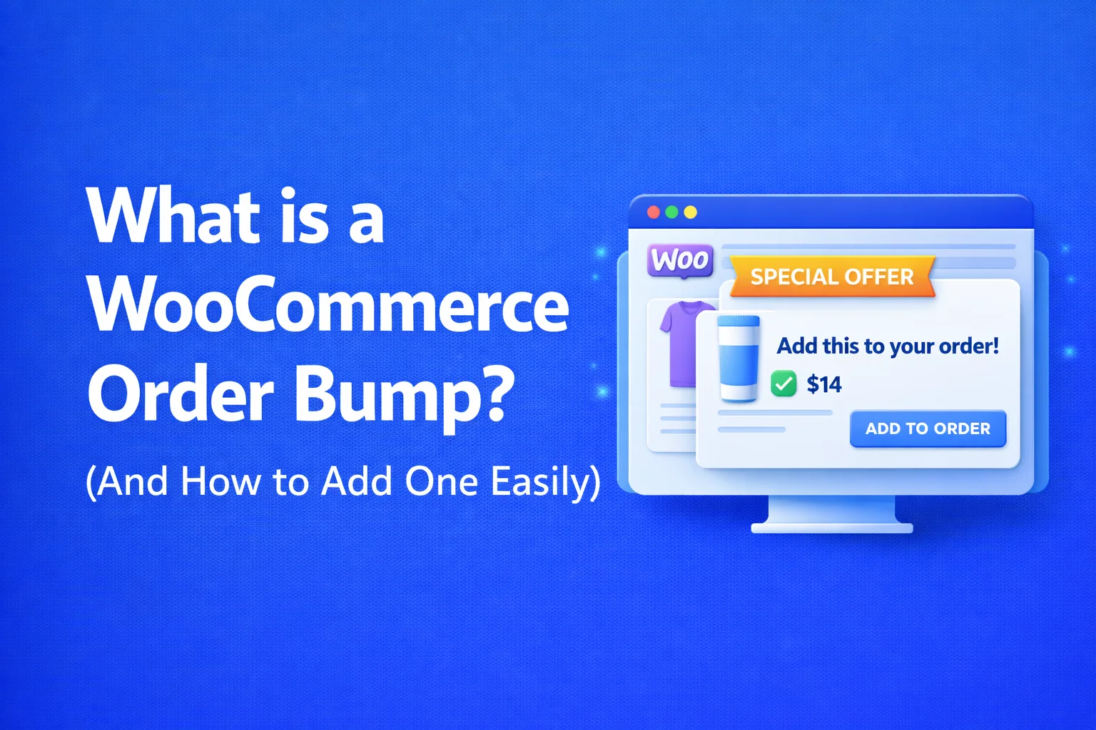
An order bump is a one-click add-on offer that appears on the WooCommerce checkout page, right before the customer submits payment. The customer can accept or skip it without leaving the page or re-entering any details.
Before getting into the “how to add one” part, it helps to understand why order bumps are a distinct tool — not just another name for an upsell or a cross-sell. The difference is timing, placement, and friction.
A standard upsell usually happens somewhere in the product discovery phase — a “you might also like” section on a product page, or a “complete the look” suggestion in the cart. These are useful, but they sit at a moment when the customer’s attention is spread across many options and the purchase decision is not yet made.
A post-purchase upsell happens after the customer has already paid — a separate moment with a separate modal, separate decision, sometimes a second payment. Also useful, but a different kind of ask.
An order bump lives right at checkout — the single most valuable moment in the entire customer journey. The buyer has already made the hard decision. Their credit card details are in. They are about to click the button. At this point, a relevant suggestion does not interrupt anything — it slots into a moment where the customer’s attention is already focused and their intent is as high as it will ever be.
That is why acceptance rates on well-matched order bumps can reach 20–30%. Not because customers are being tricked, but because the right suggestion at the right moment genuinely feels helpful.
Let’s walk through the customer experience, because this is where the logic becomes concrete. Imagine you sell a popular yoga mat. A customer has added it to their cart and arrived at checkout. They have filled in their address, chosen a shipping method, and are about to pay.
Just above the “Place Order” button, they see a small highlighted box. Inside it: a short description of a non-slip carrying strap, a photo, a price — say $11 instead of the usual $16 — and a checkbox that says “Yes, add this to my order.” Nothing else changes on the page. The bump sits calmly in the flow.
If the customer ticks the box, the item is added to their order automatically and the total updates. They pay once — for everything together. No second payment screen, no extra steps. If they ignore it, the checkout proceeds exactly as normal.
That frictionless “yes” path is the core design principle behind order bumps, and it is why they outperform almost every other on-site revenue tool on a per-impressions basis.
There is a tendency to explain order bump success with complicated marketing language. The honest explanation is much simpler: the conditions at checkout are unusually favourable for a secondary offer.
The customer has already done the hard work. They decided to buy, chose a product, entered their details. The mental overhead of “should I purchase from this store?” is gone. A small, relevant add-on sits in a different category than the primary purchase — it is evaluated against a much lower threshold, more like “does this $9 add-on make sense?” than “should I spend money here?”
Adding something at checkout costs the customer nothing extra in terms of effort. In any other context, buying a second item would mean finding it, evaluating it, going through checkout again. Here, it is one checkbox and the total updates. The effort-to-value ratio is as low as it gets in e-commerce, and that alone explains a significant part of why conversion rates are as high as they are.
When the bump product clearly connects to what is in the cart, it does not feel like a sales push — it feels like the store paid attention. That perception of relevance does two things: it makes the specific offer more likely to convert, and it improves the overall impression of the store. A well-matched bump is a subtle trust signal. A random one is a subtle trust erosion.
Not all order bumps are equal. The same mechanics that make a good bump convert at 25% can make a bad bump convert at 2% and quietly annoy the people who skipped it. The difference is almost entirely about product selection and framing.
| A good order bump | A poor order bump |
|---|---|
| Product feels like an obvious pair to the cart item | Product is a random best-seller with no cart connection |
| Price is noticeably lower than buying separately | Full price — no reason to add it here vs. later |
| Message is short, specific, and product-led | Message is generic marketing copy with urgency language |
| Visually calm — fits into the checkout without disrupting it | Bright, flashy design that competes with the checkout form |
| Easy to skip — declining feels neutral | Hard to dismiss — customer feels pressured |
The framing matters too. “Add a waterproof cover for this product — normally $18, today $11 at checkout” is specific, helpful, and honest. “SPECIAL OFFER!!! Don’t miss this!! Limited time only!!” on a product that has nothing to do with the cart is neither specific nor helpful, and most customers clock it immediately as noise.
The best way to understand a good bump is to see it in context. Here are examples across different store types — not theoretical, but the kind of pairing that store owners actually use and customers actually accept.
This is the question most store owners ask before they are willing to try a bump, and it is the right question. Adding anything to the checkout page carries risk — the checkout is the most conversion-sensitive page on any e-commerce site, and unnecessary friction there is expensive.
The short answer is: a well-designed bump does not hurt checkout conversion in any meaningful way, and many stores see a slight improvement. The longer answer involves understanding what causes abandonment at checkout in the first place.
What does hurt checkout conversion is a bump that is designed poorly: one that clutters the page visually, uses aggressive language, has an unclear decline path, or shows something completely irrelevant to the cart. A bump that looks out of place creates doubt about whether the customer accidentally opted into something they did not want — and that creates hesitation.
A bump that is clean, visually integrated, clearly labelled, and easy to skip is a different experience entirely. It tends to be ignored by customers who are not interested, and accepted by a meaningful percentage of those who are — with no impact on either group’s willingness to complete the checkout.
WooCommerce does not include order bump functionality out of the box. The native checkout has a cart summary and payment fields — that is it. To add a bump, you need either a dedicated plugin or a funnel builder that supports WooCommerce checkout customisation.
There are a few options available, ranging from very lightweight tools to complex funnel builders. What separates them in practice is not the feature list — it is the admin experience, the targeting flexibility, and whether the resulting checkout still feels like a checkout rather than a landing page.
Here is how setting up a bump typically works with a dedicated WooCommerce funnel plugin like Smart Funnel. The process is designed to take under 15 minutes for a first bump, with no code involved.
Order bumps, post-purchase upsells, and related product recommendations — built for WooCommerce, managed from one clean admin. From $39/year for a single site.
Once your bump is live, the metric that matters most in the early days is the acceptance rate — the percentage of customers who see the bump and choose to add it. This tells you whether the product selection and framing are resonating, independent of traffic volume.
If your acceptance rate is lower than you expected, the most common culprits are:
Everything in this guide comes down to one practical action: pick your single best-selling product, identify the one complementary item most customers would genuinely want with it, set a 10–15% checkout-only discount, and launch one bump. That is it.
You do not need to optimise the discount percentage, A/B test the message, or set up four different bumps with complex conditions. Those things come later, after you understand what your customers respond to. Right now, the priority is getting one bump live and learning from real data.
Order bumps are rare in the sense that they are both genuinely simple to implement and genuinely impactful on revenue. Most store owners who try them properly — with a relevant product, a fair discount, and a clean checkout experience — see a meaningful return within the first two weeks. The Smart Funnel plugin was designed for exactly this: getting the first bump running quickly, then expanding as your store grows.
One relevant suggestion. One checkbox. One click. That is all it takes to start lifting revenue from every single checkout — without touching your traffic, your prices, or your products.







Didn't realize that little "add a mat cleaner for $5" box had a name until I read this. just assumed it was part of the checkout flow. Works though ticked it without thinking twice.
I just set up my first order bump for my yoga mats, and your guide made it so easy. The checkbox trick is genius, but I gotta ask do customers ever feel like they're getting pushed into it? last thing I want is to make checkout feel sketchy or aggressive. Any tips for keeping it smooth and natural?
Hey, that one click add on is awesome.
Hey, love how this keeps everything on one page no jumping through hoops. clean and simple!