Next-Level Code. Nexuvibe Style ...
Hrs
Min
Sec

Cart abandonment is the single most expensive problem in e-commerce. A customer found your store, browsed your products, chose what they wanted, added it to the cart, clicked through to checkout, and then left. They were seconds away from giving you money and they walked away. The data on this is consistent and sobering. The Baymard Institute has documented an average cart abandonment rate of 69.82% across dozens of studies. That means for every 10 customers who start the checkout process, only about 3 finish it.
Some of that abandonment is inevitable. People window-shop online just like they do in physical stores. But a significant chunk of it is caused by preventable checkout friction: too many form fields, unexpected costs, forced account creation, confusing layouts, and forms that ask irrelevant questions. These are problems you can fix. And fixing them does not require a complete redesign of your store. In many cases, a few targeted changes to your checkout fields and layout can produce measurable improvements in your completion rate.
This guide covers 10 specific, actionable changes to your WooCommerce checkout page that address the most common causes of abandonment. Several of these changes involve editing, removing, or adding checkout fields, which is where a WooCommerce checkout field editor with conditional logic and per-product customization becomes essential.
This is the highest-impact change you can make and it takes the least effort. Look at your checkout form right now and ask yourself: which of these fields do I actually need to fulfill an order? The answer is almost always fewer than what WooCommerce includes by default.
The “Company Name” field is irrelevant for most B2C stores. “Address Line 2” confuses a lot of customers who are not sure whether to put their apartment number there or in Address Line 1. The “Phone” field is debatable: some stores need it for delivery coordination, many do not. The “Order Notes” field at the bottom gets filled with random text that nobody reads. Each of these fields adds cognitive load and time to the checkout process.
Baymard’s research found that the average checkout contains 11.3 form fields, but only 7.3 are actually needed. That gap between what is shown and what is needed is where abandonment happens. Every unnecessary field is a small tax on your customer’s patience. Remove enough of them and you get a noticeably faster, less intimidating checkout experience.
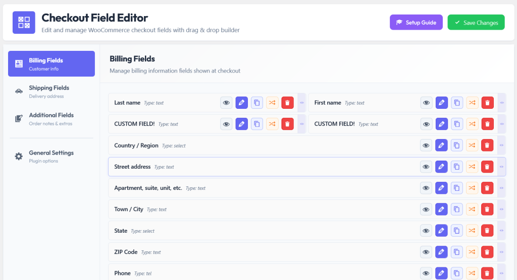
With a visual checkout field editor, disabling a field is a single click. The field is hidden from the checkout form but its configuration is preserved, so if you ever want to bring it back, another click enables it. Compare that with deleting code snippets and rewriting functions: the visual approach is faster, safer, and reversible.
The email address is the single most valuable piece of data on your checkout form. Even if a customer abandons the checkout, if you have captured their email address, you can send a recovery email. WooCommerce places the email field toward the bottom of the billing section by default, which means a customer who quits halfway through the form may never reach it.
Move it to the top. This is a simple reorder that takes seconds with a drag-and-drop editor, but it has a meaningful impact on your ability to recover abandoned carts. If a customer fills in their email, starts on the address, gets distracted, and leaves, you now have a way to follow up. Without that email, they are gone forever.
This is one of those changes that seems almost too simple to matter, but it directly affects your recovery funnel. Combined with an abandoned cart recovery plugin, having the email captured early turns abandonment from a total loss into a recoverable lead.
Not every customer needs to see every field. A customer selecting “Local Pickup” as their shipping method does not need to fill in a shipping address. A customer buying a digital product does not need delivery instructions. A customer who is not sending a gift does not need a gift message text area.
Conditional logic lets your checkout form adapt to each customer’s situation in real time. Fields appear when they are relevant and stay hidden when they are not. This means the form always looks as short as possible for each individual customer, without sacrificing data collection for the customers who do need those extra fields.
Default WooCommerce field labels are technically accurate but generically worded. “Billing First Name” is correct. But “Your First Name” feels warmer. “Street Address” is clear but “Delivery Address” tells the customer exactly what this information is used for, which builds confidence.
This may seem like a minor detail, but field labels and placeholder text are microcopy. Microcopy is one of the most underrated factors in form completion rates. Clear, friendly labels reduce hesitation. Helpful placeholder text (like “e.g., Apartment 4B” in an address field) reduces errors. A field called “Where should we deliver your order?” is more engaging and less bureaucratic than “Shipping Address Line 1.”
Renaming fields and updating their placeholder text is a quick edit in any decent WooCommerce checkout field manager with drag-and-drop editing. Change the label, update the placeholder, and save. No code, no template files, no theme editor.
If your store sells different types of products, your checkout form should not treat every order the same. A customer buying a plain pair of socks does not need a “Custom Engraving Text” field, and seeing it on the checkout page is confusing at best and alarming at worst. They start wondering if they accidentally selected a customization option and now the price is going to change.
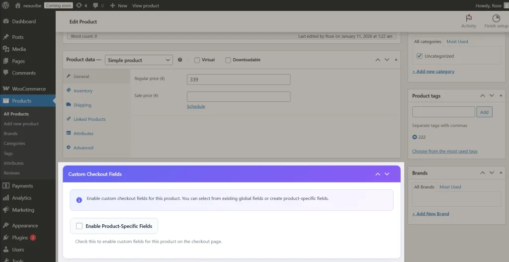
Per-product checkout fields solve this problem at the root. You assign specific fields to specific products. When that product is in the cart, its fields appear. When it is not, they are invisible. The customer buying socks sees a clean, simple checkout. The customer buying a personalized bracelet sees the engraving text field that is relevant to their purchase.
This is one of the most effective ways to reduce form length without losing data. Instead of cluttering your global checkout with fields that apply to 5% of your products, you attach those fields directly to the products that need them. The result is a checkout page that feels personalized and professional for every type of order.
One of the most common reasons customers hesitate on a checkout form is uncertainty about what is required. If a field looks mandatory but they do not have the information it is asking for, they freeze. “Do I need a company name? I do not have one. Can I just skip it? Will the order fail if I leave it blank?”
The fix is twofold. First, mark required fields clearly with an asterisk or the word “required.” Second, and this is equally important, mark optional fields with the word “(optional)” right in the field label. “Company Name (optional)” removes all ambiguity. The customer knows instantly that they can skip it without consequences. This small label change eliminates a friction point that you may not even realize is there, because it happens inside the customer’s head rather than on the screen.
Better yet, if a field is optional and most customers skip it anyway, consider removing it entirely or making it conditional. A field that nobody fills in is a field that adds visual clutter without providing value.
If you need a delivery date, do not give the customer a plain text input and hope they type a valid date in the right format. Give them a date picker. If you need them to choose between 3 delivery time slots, do not ask them to type “morning” or “afternoon.” Give them a dropdown or a radio button group.
The right field type for the right question does two things. It makes the form faster to complete because the customer is clicking or selecting instead of typing. And it ensures the data you receive is clean and consistent. A date picker always returns a properly formatted date. A dropdown always returns one of the options you defined. Plain text inputs, by contrast, return whatever the customer types, which might be a valid response or might be gibberish that your fulfillment team has to interpret.
Delivery dates, appointment slots, event attendance. A date picker prevents format confusion (“03/04/26” — is that March 4th or April 3rd?) and ensures you always get a valid date in a consistent format your systems can process.
Gift wrapping style, delivery time preference, subscription frequency. These field types eliminate typing entirely and constrain responses to valid options, which makes fulfillment faster and removes data quality issues.
Business licenses, custom artwork files, tax exemption documents. Collecting these at checkout means no follow-up emails and no order processing delays. The customer provides everything needed in one step.
More than half of e-commerce traffic now comes from mobile devices. On a phone, a checkout form that looks manageable on desktop can feel endless. Small input fields, tiny labels, and the effort of typing on a touchscreen keyboard all amplify form friction on mobile.
The field reduction and conditional logic strategies already discussed become even more important on mobile. Every field you remove saves the mobile customer from tapping into a tiny input, pecking out text on a keyboard that covers half their screen, and scrolling further down a form that already feels long. Mobile customers are also more impatient and more likely to be distracted. A shorter form has a better chance of being completed before the customer switches to another app or gets interrupted.
Beyond removing fields, think about field order on mobile. On desktop, side-by-side fields (first name on the left, last name on the right) make efficient use of horizontal space. On mobile, those same fields stack vertically, and the order they stack in matters. Make sure your field sequence makes logical sense when read top-to-bottom on a single-column mobile layout.
There is a difference between validation that helps and validation that hurts. Helpful validation catches mistakes before the form is submitted. Hurtful validation waits until the customer clicks “Place Order” and then displays a wall of red error messages at the top of the page, forcing the customer to scroll back up and figure out what went wrong.
When you add custom fields that require specific formats, like email addresses, phone numbers, or postal codes, set up validation that guides the customer rather than penalizing them. Placeholder text that shows the expected format (“e.g., +1 555-0123”) prevents most errors before they happen. Real-time inline validation that shows a green checkmark or a gentle “please check this field” message as the customer fills in each field is far less frustrating than a post-submission error dump.
Checkout optimization is not a one-time project. It is an ongoing process. After you implement the changes in this guide, measure the results. Compare your checkout completion rate before and after. Look at where customers drop off now versus where they dropped off before. Track which custom fields get filled in and which get skipped.
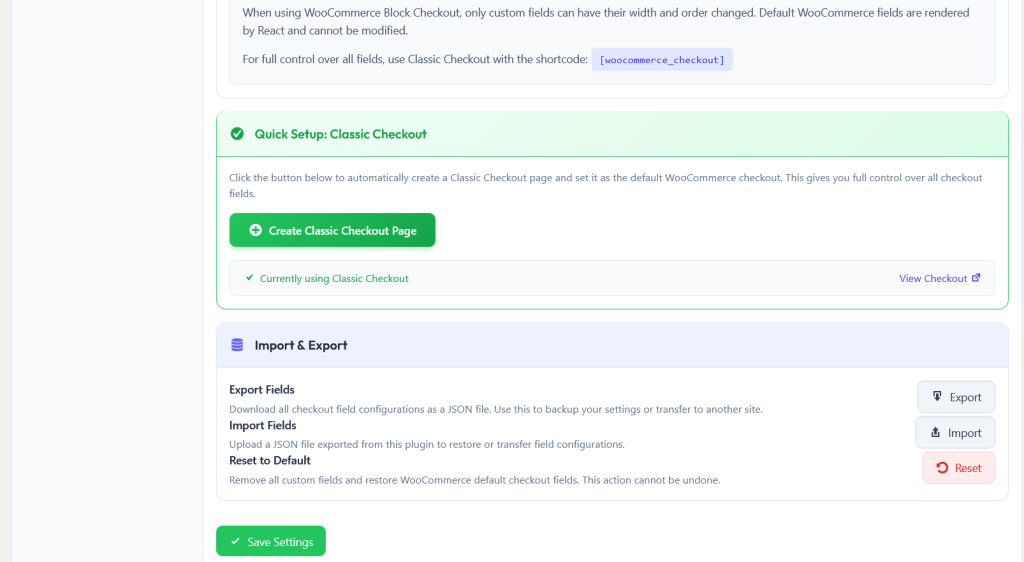
The ability to quickly make changes and test them is where a no-code WooCommerce checkout field editor with import export and one-click reset pays for itself many times over. You can try a new field layout, measure the impact for a week, and if it does not work, reset and try something different. With code-based customization, each iteration requires development time. With a visual editor, iterations are fast and risk-free.
Export your working configuration as a backup before each test. If the new layout performs worse, import the previous configuration and you are back to your last known good setup in seconds. This test-and-iterate cycle is how you find the optimal checkout configuration for your specific store, audience, and product mix.
Cart abandonment will never reach zero. Some customers were never going to buy. But the difference between a 70% abandonment rate and a 60% abandonment rate is substantial revenue for most WooCommerce stores. And the majority of the strategies in this guide are not expensive redesigns or complex technical projects. They are field-level changes: removing a field here, reordering a field there, adding conditional logic to reduce visual clutter, and using per-product fields to keep the checkout relevant.
The tools for all of this already exist. A WooCommerce checkout field editor with per-product fields, conditional logic, and visual drag-and-drop gives you the control to implement every strategy in this guide without writing code and without depending on a developer. The question is not whether optimizing your checkout will improve conversions. The question is how much revenue you are leaving on the table by not doing it.
Remove unnecessary fields, add smart conditional logic, set up per-product checkout questions, and take full control of your WooCommerce checkout experience.







Do you guys cover how to handle optional fields like "Address Line 2" without confusing shoppers?
The cart abandonment stats here are definitely eye opening. Quick question how often does Baymard refresh their research? That 69.82% number feels like a big deal, so I'd want to confirm it's up to date before overhauling anything
The phone field debate was exactly what I needed cutting steps always boosts conversions.