Next-Level Code. Nexuvibe Style ...
Hrs
Min
Sec

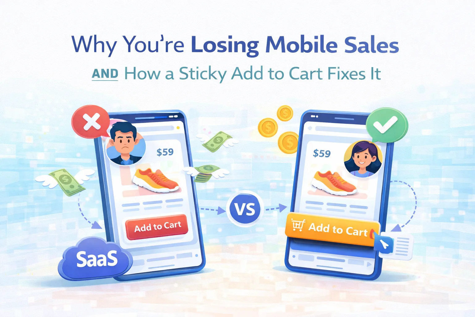
Open your WooCommerce store on a phone right now. Go to any product page. Start scrolling down to read the description, check the specs, look at the reviews. Now ask yourself: where is the “Add to Cart” button? Chances are it vanished somewhere around the third scroll. It is sitting back at the top of the page, invisible, waiting for a customer to remember it exists and scroll all the way back up to find it.
This is not a minor UX inconvenience. It is one of the leading causes of mobile cart abandonment, and it happens silently, every day, on thousands of WooCommerce stores whose owners have no idea it is happening. The customer was interested. They read the description. They checked the price. They liked what they saw. And then — because buying required an extra action that interrupted the moment of decision — they left.
This guide is about understanding exactly why mobile product pages fail, what the research and behavior patterns tell us about how people actually shop on their phones, and why a well-implemented sticky add to cart bar for WooCommerce is one of the highest-return, lowest-effort conversion improvements you can make.
We will also look closely at how Sticky Add to Cart by NEXU WP handles this problem — and why the way it handles it matters more than it might first appear.
Mobile traffic has been the dominant source of ecommerce visits for years now. Depending on your industry and region, somewhere between 60% and 75% of your product page views are happening on a phone. That number is not a trend anymore — it is the baseline. Mobile is not the “other” channel. It is the main channel.
And yet the default WooCommerce product page was not designed around how people actually use phones. It was designed around a desktop layout that got scaled down. The “Add to Cart” button sits in the product summary section, right below the price, which is exactly where it belongs — on a desktop screen where everything is visible at once. On a phone, where the viewport shows roughly 600 pixels of height at a time, that same button disappears the moment a customer starts engaging with the product.
What makes this particularly painful is that the customers who scroll deepest into your product page are your most engaged visitors. They are not bouncing. They are reading. They are considering. They want more information before they commit — which is perfectly reasonable buying behavior. The cruel irony is that your most interested customers are also the ones who have scrolled the furthest away from your “Add to Cart” button.
A customer who has read your full product description, checked your specifications, looked at your reviews, and confirmed your return policy is not a browsing customer. They are a buying customer. And if they have to scroll back up to the top of the page to complete the purchase, you are introducing unnecessary friction right at the most critical moment of the entire customer journey.
Store owners who recognize this problem usually try one of a few standard approaches. Most of them don’t work as well as expected, and some of them make things worse.
Remove descriptions · Cut reviews · Trim specs
Some store owners respond by cutting down product page content so the “Add to Cart” button stays visible longer. This trades one problem for another. Product descriptions reduce uncertainty. Reviews build trust. Specifications answer objections. Removing them to keep the button visible means losing the content that convinces people to click the button in the first place.
Second button · Bottom of page · Static placement
Adding a second “Add to Cart” button at the bottom of the product page is a reasonable thought, but it only helps customers who scroll all the way to the bottom. Anyone who reaches their decision-making moment anywhere in the middle of the page — after reading the description, say, but before the reviews — still has no accessible button in their current viewport.
Always visible · Context-aware · Non-intrusive
A sticky bar that appears precisely when the original “Add to Cart” button scrolls out of view — and disappears again when the customer scrolls back to it — solves the problem elegantly. The purchase action is available at any point in the customer’s scroll journey. It never competes with the original button. It supports the product page without overriding it.
Not all sticky add to cart implementations are equal. A sticky bar that is always visible, regardless of where the original button is, creates visual clutter and competes with the product page design. A sticky bar that shows the wrong product information — or no product information — forces the customer to scroll back up to confirm what they are buying. A sticky bar that breaks on variable products, showing an “Add to Cart” button before the customer has selected their size or color, creates errors and frustration.
Good implementation is context-aware. The bar appears only when needed. It carries enough product context — title, thumbnail, price, stock status — that customers know they are still buying the right thing without needing to scroll back up. And it handles variable products intelligently, guiding customers to the selection process rather than letting them hit an error.
Sticky Add to Cart: Mobile Floating Bar & Conversion Booster for WooCommerce by NEXU WP was built around a specific behavioral insight: the sticky bar should support the product page, not compete with it. This sounds simple, but it requires more nuance than most implementations deliver.
The bar activates precisely when the original add to cart area scrolls out of the viewport, and steps back when the customer returns to that section. There is no overlap, no competition with the product page layout, no persistent element cluttering the screen during the initial product presentation.
Product title, thumbnail, price, rating, and stock messaging can all be displayed in the sticky bar. When a customer scrolls to the reviews section and decides they are ready to buy, they see the product name and price right there in the floating bar — no need to scroll back up to confirm the details they just read.
You can enable the sticky bar for mobile only, desktop only, or both. This matters because the problem is most acute on mobile — but some stores see strong engagement with a desktop version too. The setting gives you control without requiring you to commit to a single behavior across all devices from day one.
For products with variations — sizes, colors, options — the plugin handles selection intelligently. When a customer has not yet chosen a variation, the bar guides them to the selection form rather than triggering an error. You can configure whether it scrolls to the variation form or opens a modal. Either way, customers are never stranded at a dead end.
The design panel covers bar height, typography, colors, animation type, and z-index — enough to make the sticky bar feel like a natural extension of your store’s visual language rather than a third-party widget dropped on top of it. On desktop, there is also a trust badge area with configurable ordering, which is useful for stores that want to reinforce specific purchase confidence signals at the moment of decision.
The plugin loads only on product pages, and only for the sticky bar behavior. It has no effect on your public-facing page speed scores. For stores where Core Web Vitals are a priority — which they should be for SEO reasons — this matters. A conversion plugin that hurts your search rankings is not a net positive.
A WooCommerce mobile sticky footer add to cart bar improves conversion on virtually any product page with meaningful content below the fold. But the impact is not uniform across all store types. Some configurations benefit more than others.
| Store type | Why sticky bar helps | Impact level |
|---|---|---|
| Fashion & apparel | Long product descriptions, multiple sizing guides, customer photos in reviews — customers scroll a lot before deciding | Very high |
| Electronics & tech | Specification tables, comparison content, and technical descriptions push “Add to Cart” far below the fold | Very high |
| Health & beauty | Ingredient lists, usage instructions, and safety information create long pages with high-intent scrollers | High |
| Home & furniture | Material specs, dimension tables, and multiple product images create scroll depth before the decision is made | High |
| Books & digital goods | Preview content, author information, and review summaries create moderate scroll depth | Moderate |
| Simple low-content pages | If your product page has minimal content, the button rarely scrolls out of view — marginal benefit | Low |
The pattern is straightforward: the more content you have below the fold to persuade customers, the more important it is to keep the purchase action accessible while they read it. Rich content and an inaccessible buy button work directly against each other.
The mobile conversion problem is not complicated to understand. Your most engaged customers — the ones who read everything, who take their time, who scroll through your full product story — are the ones most likely to find themselves far away from your “Add to Cart” button when they finally decide they want to buy. Fixing this does not require a full store redesign. It requires a single, well-implemented sticky bar that meets customers wherever they are in the page.
Sticky Add to Cart: Mobile Floating Bar & Conversion Booster for WooCommerce is built around that single insight — and executes it with enough control and polish to fit any store without compromise.
Scroll-triggered floating bar. Context-rich product display. Variable product support. Full design control. Device targeting for mobile and desktop. Zero impact on page speed. Starting at $19/year.







Finally no more lost sales!
Hey everyone! i just tried this sticky cart fix on my WooCommerce site after reading about it, and wow what a difference. i run a small financial advisory side hustle selling ebooks, and I noticed a lot of mobile users were bouncing before buying. I tested it myself: scrolled down to read some reviews, and there was the "Add to Cart" button right when I decided to buy. No more searching for it! If you're losing mobile sales, this is a great place to start. Totally worth it!
The sticky cart idea makes sense but setup was a little confusing at first. had to dig into the guide to get it working right. Once configured, it does keep the button visible which is good for mobile users.
Hey, I grabbed this hoping it'd fix my mobile checkout issues, but honestly? the sticky cart bar still feels like an afterthought.