
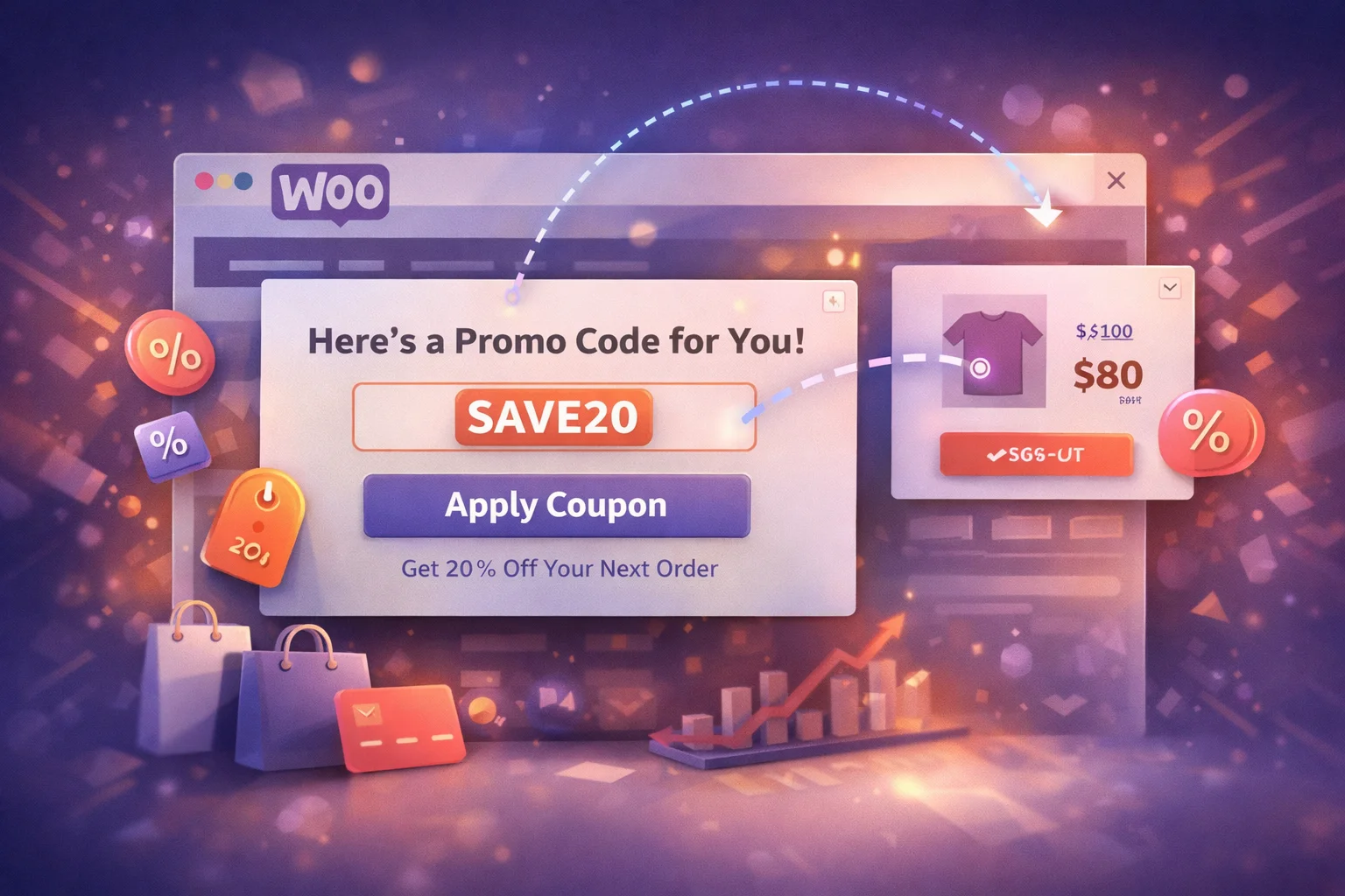
Here is a scenario that happens thousands of times a day on WooCommerce stores: a visitor sees a coupon code in a popup, mentally notes it, continues browsing, adds products to their cart, reaches checkout, and then cannot remember the code. Or they remember part of it. Or they try to go back and find the popup, which is gone. The coupon was delivered, but it was never used. The store gave away margin potential on the popup investment without capturing the sale.
The gap between displaying a coupon code and having a customer use that code is wider than most store owners realize. According to Statista’s research on digital coupon usage, while the vast majority of online shoppers are interested in digital coupons, redemption rates for displayed codes are often surprisingly low. The problem is rarely the offer itself. It is the delivery mechanism.
This guide focuses on the practical details that determine whether a WooCommerce coupon popup actually converts: copy functionality, code formatting, visual design, timing, and the small implementation details that make the difference between a coupon that gets forgotten and one that gets redeemed.
Why coupon popups fail: the redemption gap
The journey from seeing a coupon code to using it at checkout involves multiple friction points, and each one reduces the redemption rate. Understanding these friction points is necessary before discussing solutions because the solutions only make sense in context of what they are solving.
A visitor sees “SAVE15” in a popup, dismisses it, browses for ten minutes, adds products to their cart, reaches checkout, and types “SAVE10” or “15OFF” or something else that is close but wrong. Human short-term memory is unreliable for arbitrary strings of text. Any coupon delivery method that relies on the customer remembering the code for more than a few seconds is going to lose a significant percentage of potential redemptions to simple memory failure.
Even when a visitor remembers the code, they need to type it manually into the coupon field at checkout. Typing is friction. On mobile devices, it is significant friction. Every additional action between seeing the code and applying it reduces the probability of completion. The customer has to locate the coupon field, tap into it, type the code correctly (including capitalization if case-sensitive), and apply it. Each step is a potential drop-off point.
Most popup implementations show the coupon once and then disappear. If the visitor dismisses the popup to continue browsing (a natural behavior), the code is gone. There is no way to retrieve it. The visitor cannot find the popup again, cannot check what the code was, and is left trying to remember something they saw briefly several minutes ago. The popup served its purpose of displaying the code but failed at the more important purpose of enabling its use.
The copy-to-clipboard feature: the most important element of any coupon popup
If a coupon popup does only one thing well, it should make the code instantly copyable. A single tap or click to copy the code to the clipboard eliminates memory failure and manual entry friction simultaneously. The visitor copies the code in one action, navigates to checkout, pastes it in one action, and applies the discount. Two actions instead of a sequence involving memorization, navigation, and manual typing.

The implementation details of the copy feature matter more than you might expect. A well-executed copy-to-clipboard function provides visual confirmation when the code is copied (the button text changes from “Copy” to “Copied!”), uses a distinct visual treatment for the code itself so it stands out from the surrounding message text, and works reliably on both desktop and mobile browsers. The confirmation feedback is particularly important because it gives the visitor confidence that the code is in their clipboard and ready to paste.
Without copy functionality, the best case scenario is that the visitor manually selects the text, copies it through the browser’s context menu, and pastes it at checkout. That process requires precise text selection on a small popup element, which is particularly difficult on mobile devices where selecting text within a modal overlay often triggers the wrong interaction. The worst case, and far more common, is that the visitor simply tries to remember the code and fails.
Store owners who have tested coupon popups with and without copy-to-clipboard functionality consistently report that the copy-enabled version produces significantly higher redemption rates. The mechanism is straightforward: removing the memory and typing steps from the process means fewer people abandon the coupon between seeing it and using it. If your current coupon popup does not include a copy button, adding one is likely the single highest-impact change you can make.
Writing coupon popup messages that drive action
The message surrounding the coupon code is as important as the code itself. A well-written coupon popup message accomplishes three things in a very small space: it communicates the value of the offer, it tells the visitor exactly what to do, and it creates a reason to act now rather than later.
The headline should communicate value: “Save 15% on your order today” is stronger than “Use code SAVE15.” The benefit is the reason to care. The code is the mechanism. Leading with the code puts the least interesting piece of information first. Leading with the benefit answers the visitor’s first question (“why should I pay attention to this?”) before asking them to do anything.
The code itself should be in a visually separate element within the notification: a bordered box, a contrasting background color, monospaced font, or all three. This visual distinction serves two purposes. It makes the code immediately identifiable as the piece of information the visitor needs to save, and it provides a clear click target for the copy-to-clipboard action. A code that blends into the surrounding text is easy to overlook and harder to select.
If the coupon expires in 48 hours, say so. If the promotion is valid through the weekend, mention the specific end date. Honest time constraints create urgency naturally because they are real. Fake countdown timers and “only 3 left!” messages that reset every visit erode trust. Visitors are increasingly aware of manufactured urgency tactics and they undermine the credibility of the offer. Real deadlines create the same motivational effect without the trust cost.
If the coupon has a minimum order value or excludes certain products, mention it briefly. “15% off orders over $50” is clear and honest. Discovering at checkout that a coupon does not apply to the items in the cart is one of the most frustrating e-commerce experiences, and it wastes the goodwill that the popup was supposed to create. A short qualification line prevents disappointment and reduces support requests.
Visual design principles for high-converting coupon popups
The visual treatment of a coupon popup affects both its initial attention capture and its conversion rate. A well-designed coupon notification does not need to be flashy or aggressive. It needs to be clear, readable, and focused on the single action you want the visitor to take.
A coupon popup that looks like it belongs to a different website breaks visual trust. Use your store’s color scheme, typography that complements your theme, and styling that feels like a natural extension of your brand. A popup that clashes with the surrounding page looks like an advertisement from a third party, which reduces trust and consequently reduces the likelihood that a visitor will use the code. The WooCommerce notification popup manager with full styling customization gives you control over colors, fonts, borders, and positioning so every notification looks like part of your store.
A coupon popup that includes a product image alongside the discount code creates a visual connection between the offer and the merchandise. For category-specific promotions, showing a representative product from the discounted category reinforces the relevance of the offer. For general store-wide coupons, a well-chosen hero product or lifestyle image adds visual weight to the notification and makes it more memorable.
More than half of WooCommerce traffic is mobile. Your coupon popup needs to work perfectly on a small screen. That means large enough text to read without zooming, a copy button that is easy to tap with a thumb, a close button that does not require precision targeting, and a format that does not cover the entire screen (which Google penalizes). Notification bars and small slide-in popups are typically more effective on mobile than full-screen modals.

When and where to show your coupon popup
The timing and placement of a coupon popup determines whether it reaches visitors at a moment when they are receptive to a discount or at a moment when they just want to browse undisturbed. Different placement strategies work for different types of coupon campaigns.
The common thread across all these placements is contextual relevance. The coupon appears where and when the visitor is most likely to find it useful, and it stays out of the way everywhere else. A cart abandonment coupon on the homepage is as irrelevant as a welcome coupon on the checkout page. Each placement strategy exists because it matches a specific visitor mindset at a specific point in the shopping journey.

Notification format options for coupon delivery
The visual format you choose for your coupon popup affects both its impact and its intrusiveness. Each format has strengths for different coupon delivery scenarios.
The most effective format for category-specific coupon campaigns. Pair the coupon code with an image of a product from the discounted category. The product image creates an immediate visual connection between the offer and the merchandise, making the coupon feel specific and relevant rather than generic. This format works particularly well for seasonal promotions and new collection launches where the product imagery itself generates interest.
Clean, fast-loading, and ideal for simple store-wide coupons where the offer speaks for itself. Text-only notifications load instantly (no image assets to fetch), work consistently across all devices, and focus the visitor’s attention entirely on the message and the code. For straightforward percentage or dollar-off coupons with broad applicability, text-only is often more effective because it communicates the essential information without visual distraction.
A notification bar that remains visible at the top of every page with the coupon code embedded directly in the bar text. This format solves the popup disappearance problem entirely: the code is always visible, always available. It is particularly effective for ongoing promotions that run for days or weeks, where the goal is constant ambient awareness rather than a single attention-grabbing moment.

Measuring coupon popup performance
A coupon popup that is not measured is a coupon popup that cannot be improved. There are specific metrics that tell you whether your coupon delivery is working, and each one diagnoses a different potential problem in the redemption chain.
What percentage of visitors who see the popup actually click the copy button? A low ratio suggests the offer is not compelling enough, the code is not visually prominent, or the popup timing is wrong. If visitors are seeing the popup but not copying the code, the problem is in the popup itself, not in the checkout process.
Of the visitors who copy the code, how many actually use it at checkout? A high copy rate with a low redemption rate suggests a problem between the popup and checkout: perhaps the code has restrictions the visitor discovers too late, the coupon field is hard to find, or the discount is not enough to overcome the remaining purchase hesitation. Track WooCommerce coupon usage in your orders to measure this directly.
The ultimate measure: does the revenue from coupon-influenced purchases exceed the revenue lost to the discount? If a 10% coupon popup recovers 20 abandoned carts worth $150 average, that is $3,000 in revenue with $300 in discount costs, a strong net positive. If the same coupon is shown to 500 visitors who would have bought anyway, you are giving away $7,500 in margin for zero incremental revenue. Targeting precision determines which scenario you end up in.
The coupon popup is not a set-and-forget element. It is a conversion tool that needs monitoring, measurement, and periodic adjustment. The stores that get the highest redemption rates are the ones that test different messages, adjust timing based on performance data, and refine their targeting to reach the visitors who benefit most from the offer.
The WooCommerce Deal Notification Popups Manager with built-in coupon display and one-click copy gives you the functional foundation: copy-to-clipboard, multiple notification formats, full styling control, and targeting options that ensure the right visitors see the right coupons. What you build on top of that foundation, the specific offers, the messaging, the placement strategy, is what turns displayed codes into redeemed sales.
Display coupon codes that customers actually use
Copy-to-clipboard functionality, multiple notification formats, full visual customization, and precision targeting. Show the right promo code to the right visitor at the right moment.





So the popup lets you copy the code in one click?
Just got this popup running on my client's WooCommerce site, and I've gotta say that copy to clipboard feature is exactly what makes or breaks these things. I've lost count of how many popups I've seen where the discount code just sits there, forgotten by the time someone hits checkout. but here?
I love that this popup actually shows the coupon code in a way that grabs attention big, bold, and right in your face. no squinting or hunting for tiny text. but here's the thing: even when I remember the code, typing it out at checkout feels like a chore. If I'm on my phone, it's even worse with autocorrect fighting me. A one tap copy button would save so much hassle and probably get more people to actually use the discount. The design is on point, but the extra step still trips me up
The copy to clipboard button is why this popup actually works. No more lost codes or customers squinting at tiny text just one click and it's saved. Simple, but it's the difference between a coupon seen and a coupon used