Next-Level Code. Nexuvibe Style ...
Hrs
Min
Sec

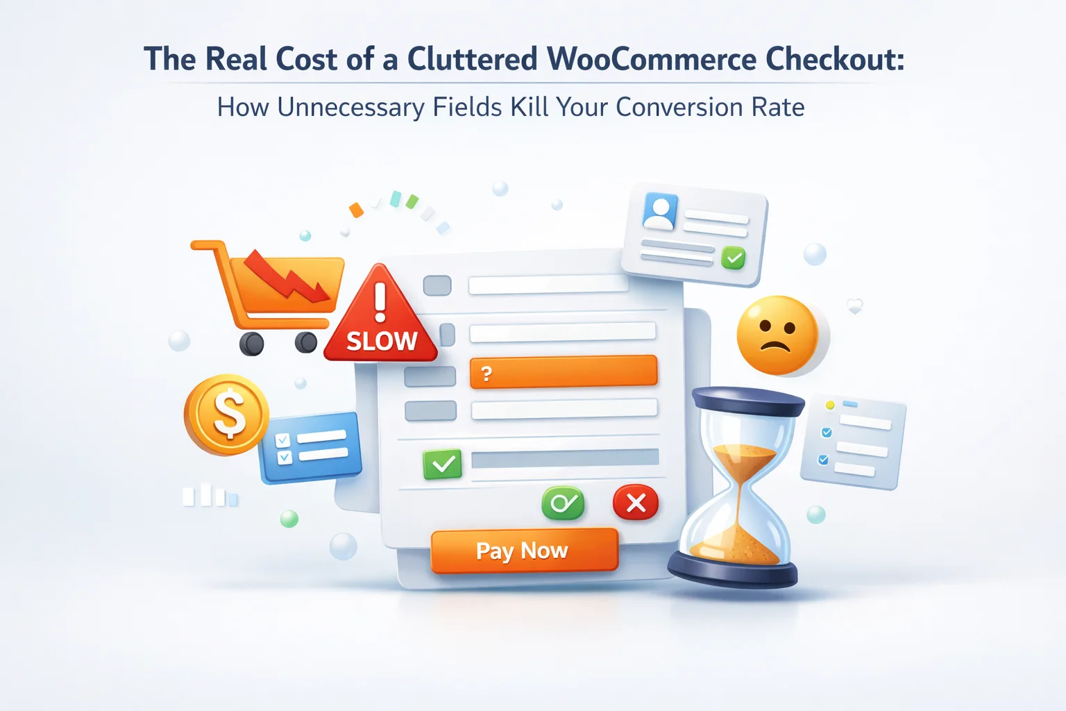
There is a persistent assumption in e-commerce that a longer checkout form is more thorough, more professional, or somehow safer than a shorter one. Collect more information. Ask more questions. Cover every possible operational edge case at the point of purchase. The result, in most WooCommerce stores, is a checkout page that asks consumers for their company name when they are buying a birthday present, requests a fax number in 2026, demands a detailed billing address from a customer buying a digital download that will never be posted anywhere, and presents a wall of fields that the customer has to work through before they are allowed to give you money.
The cost of this approach is measurable and substantial. Research from the Baymard Institute — the most rigorous source of checkout usability data available — consistently shows that form length is one of the primary drivers of checkout abandonment. Their 2024 large-scale usability study found that the average checkout in their study contained 14.88 form fields, while the optimal number for most stores is 7 or fewer. That gap between 14.88 and 7 is not a minor styling preference. It is a conversion rate difference that translates directly into lost revenue at every price point.
This guide covers the actual mechanics of how checkout form length affects conversion rates, what the research says about specific field types and their abandonment contribution, how to audit your current WooCommerce checkout for unnecessary fields, and how the NEXU Advanced Checkout Field Editor for WooCommerce conversion optimisation gives you the tools to remove, hide, and restructure fields for maximum conversion without losing any operational data you genuinely need.
The aim is not a checkout form with the fewest possible fields. It is a checkout form with exactly the right fields for your specific store — no fewer than necessary to fulfill orders correctly, and not one more than that.
The relationship between checkout form length and conversion rate is one of the most reliably documented findings in e-commerce research. The data comes from multiple independent sources and has been replicated across different markets, price points, and product categories. Here is what the research says.
The Baymard Institute’s large-scale checkout usability research is the most comprehensive study of checkout behavior available to e-commerce practitioners. Their findings on form length are striking: the average top-1000 US e-commerce checkout contains 14.88 form fields, but based on their usability testing, the optimal number of fields for most stores is between 6 and 8. The gap of approximately 7 unnecessary fields represents friction that is not serving the customer and is not serving the business — it is there because of defaults, caution, and the mistaken assumption that more information is always better.
Statista and multiple e-commerce analytics platforms consistently report checkout-specific abandonment rates of 65–80% across e-commerce globally. Baymard’s own benchmarking puts the documented-reason abandonment rate at 18% for “too long or complicated checkout process” among shoppers who have abandoned a purchase in the past. That 18% represents customers who intended to buy and did not complete the purchase specifically because of form complexity — not because of price, not because of shipping costs, not because of distrust. Because of fields.
Mobile now accounts for over 60% of e-commerce traffic globally and a growing proportion of actual purchases. On a mobile device, every additional form field requires a tap, a keyboard summon, data entry, and a keyboard dismissal. The physical effort of completing a 14-field form on a phone is several times greater than completing a 7-field form. The correlation between mobile form length and mobile conversion rate is stronger than the same correlation for desktop. Stores with long checkout forms disproportionately lose mobile customers.
The impact of extra form fields is not linear. The conversion cost of the 12th field is not the same as the conversion cost of the 3rd field. Understanding why helps explain why long checkout forms perform so much worse than their total field count alone would suggest.
Each form field requires a micro-decision: read the label, determine what is being asked, retrieve or compose the answer, enter it accurately, move to the next field. This decision-making process depletes cognitive resources. The 10th field is harder to complete than the 3rd not because it is objectively more difficult but because the customer has already made nine decisions since they started the form. Customers who reach field 10 with depleted cognitive resources are significantly more likely to abandon than customers who encounter that same field at position 3.
When a customer encounters a field that is clearly irrelevant to their purchase — a company name field when they are buying a personal gift, an address field when they are buying a digital download — it signals that the checkout was not designed thoughtfully. This perception of careless design transfers to the brand as a whole. A customer who encounters an irrelevant field thinks, at some level, “this company does not know what it is doing.” That erosion of confidence is one of the less-measured but real costs of unnecessary fields.
Customers consistently overestimate how long it will take to complete a long form compared to a short one. A 14-field form feels substantially longer than it is because the customer sees all the fields at once and makes a pre-form assessment of the effort required. This pre-form assessment is a significant abandonment trigger — customers who see a long form before they start filling it in are more likely to abandon at that point than at any subsequent point during completion. Visible form length is itself a conversion rate factor independent of the actual time required to complete the form.
Customers who are asked for information that does not obviously relate to their purchase wonder why it is being collected. In an era of heightened awareness about data privacy — following years of GDPR coverage, data breach news, and growing consumer skepticism about how companies use personal data — a checkout that asks for more than is clearly necessary for the transaction raises a question that some customers will not wait to have answered: “Why do they need this?” That question is more often resolved by abandonment than by trust.
The default WooCommerce checkout contains a set of fields that were designed for a generic e-commerce store selling physical goods to individual consumers. For many stores this default is already too long. For some store types it includes fields that are actively irrelevant. Here is a direct assessment of each default field.
Reducing unnecessary fields is the first half of checkout optimisation. The second half is adding the fields you genuinely need — engraving text for a jewellery store, delivery instructions for a furniture store, dietary requirements for a food subscription — in a way that minimises their conversion impact while maximising their operational value.
The key principle is that custom fields should not increase the form length for customers who do not need them. Conditional logic — showing fields only when their trigger condition is met — is what makes it possible to build a checkout that is both lean for most customers and complete for those with specific requirements. A jewellery store that shows engraving fields only when an engravable product is in the cart presents a short checkout to customers buying earrings and a complete personalisation form to customers buying a ring. Neither experience is unnecessarily long.
Configuring custom fields at the product level rather than the global checkout level means those fields only appear when the relevant product is in the cart. A customer buying your standard products never sees the per-product fields. A customer buying a personalised item sees exactly the fields needed for that item. This architecture separates “fields needed for this specific order” from “fields shown to all orders” — which is almost always the right separation for stores with mixed catalogs.
When a field is relevant to an entire category of products rather than one specific product — “delivery time preference” for all large item products, “dietary requirements” for all food products — cart-content conditional logic triggers the field when any product from the relevant category is in the cart. Customers buying only small accessories see a standard checkout. Customers buying furniture see the delivery-specific fields. Same store, intelligently differentiated checkout experiences.
B2B fields — VAT number, PO reference, company name — are irrelevant to individual consumers. Hiding them behind a buyer type selector that only business buyers need to interact with means the B2B fields add zero friction to the consumer experience. The checkout is lean for the 80% of consumers and appropriately equipped for the 20% of business buyers, without compromise on either side.
The revenue impact of checkout optimisation is calculable. If you have access to your WooCommerce analytics, you can estimate the value of checkout field reduction with reasonable precision. Here is the framework.
This calculation is conservative. Stores with particularly long or poorly-designed checkouts, or stores with high mobile traffic where form length creates disproportionate friction, often see improvements at the higher end of the Baymard range — 20–35% rather than 10%. The calculation also does not account for the compounding effect over time: improved conversion rate means more customers completing purchases, which over months and years represents substantially more than the per-month revenue gain.
The investment required to achieve this improvement — auditing your current checkout, identifying unnecessary fields, using a tool like the NEXU Advanced Checkout Field Editor to hide or remove them — is typically measured in hours, not days. The return on that investment begins with the first visitor to experience the improved checkout and continues for as long as the store operates.
Here is a practical checkout field audit you can complete in under an hour to identify and eliminate unnecessary fields from your WooCommerce checkout.
Go to your checkout page in an incognito browser and write down every visible field — including fields that are optional and fields you might have overlooked like address line 2, county, order notes. Count them. If the total is over 10 for a standard physical goods store, you almost certainly have fields to remove. If it is over 14, you have a significant conversion problem you can start fixing today.
For each field, ask: does the absence of this information prevent us from fulfilling the order correctly? If yes, keep it. If no, ask: does having this information improve fulfilment, reduce errors, or serve a documented business purpose? If yes, keep it as optional. If no, remove or hide it. Be honest. Many stores keep fields because they “might be useful” — that is not the same as genuinely necessary.
For fields that you need to keep but that do not apply to every order — company name for B2B buyers, delivery instructions for certain product types, special handling requests for fragile items — assess whether they could be moved to conditional display rather than always visible. A field that is relevant to 20% of orders should be hidden for the 80% of customers for whom it serves no purpose.
In the NEXU Advanced Checkout Field Editor, disable or hide fields that you identified as unnecessary in step 2. Make optional fields that are useful but not required (phone, company name). Configure conditional logic for fields that are only relevant to a subset of orders. Export the configuration before making changes so you have a rollback option. Test the checkout after each change to confirm the form renders correctly and orders process successfully.
Record your checkout completion rate (from WooCommerce reports or Google Analytics) before making changes. After implementing field reductions, monitor the same metric over the following 2–4 weeks against the same period from the prior month. A meaningful improvement in checkout completion rate is your confirmation that the field reduction has had the expected effect. Document the change for future reference — knowing which specific changes moved the metric is valuable institutional knowledge.
A well-optimised WooCommerce checkout for a typical physical goods store serving individual consumers has roughly seven to eight fields: email, first and last name (or combined full name), billing address (street, city, postcode), country, and phone (optional). Everything else is either conditional (appearing only when relevant) or per-product (appearing only when a specific item requires it).
This does not mean a stripped-down, impersonal checkout that fails to capture information your business needs. It means a checkout that is smart enough to ask the right questions to the right people at the right point in the purchase process. A food subscription customer sees dietary preferences fields because they matter. A B2B buyer sees VAT and PO number fields because they need them. A digital download customer sees no address fields because there is nothing to deliver to an address.
The NEXU Advanced WooCommerce checkout field optimisation plugin gives you the tools to build exactly this checkout: hide unnecessary default fields, make optional fields that should not be required, add conditional logic so that additional fields appear only for the customers who need them, and configure per-product fields for specific product types without polluting the global checkout. The result is a checkout that is simultaneously leaner for most customers and more complete for those with specific requirements — and one that converts measurably better than the cluttered default WooCommerce form that most stores are still running.
NEXU Advanced Checkout Field Editor lets you hide unnecessary default fields, make required fields optional, configure conditional logic so extra fields appear only when relevant, and add per-product fields for the items that genuinely need them — all without code.







This guide finally put numbers to what I knew was killing my conversions.
This guide really opened my eyes to how
Finally, a guide that cuts the fluff!
Hey! Loved the breakdown on how shorter forms boost conversions