Next-Level Code. Nexuvibe Style ...
Hrs
Min
Sec

There is a persistent myth in the web design world that short forms convert better than long forms. It sounds intuitive: fewer fields, less work, more completions. But it is only half true. What actually determines whether people complete a form is not the number of fields. It is how the form feels while filling it out. A 5-field form with confusing labels and a broken layout will be abandoned more than a 30-field form that guides users through a clear, well-paced experience.
This matters because many WordPress sites cannot reduce their forms. Scholarship applications need detailed academic history. Insurance quotes need comprehensive personal information. Wholesale order forms need variable product line items. Group registrations need per-person details. The data requirements are real. What can change is the design of the collection experience.
This guide presents seven UX improvements that make long WordPress forms work. Each technique is practical, implementable in Gravity Forms with either native features or focused plugins, and backed by the actual experience of building forms that collect thousands of submissions. No theory-only advice. Only things that work.
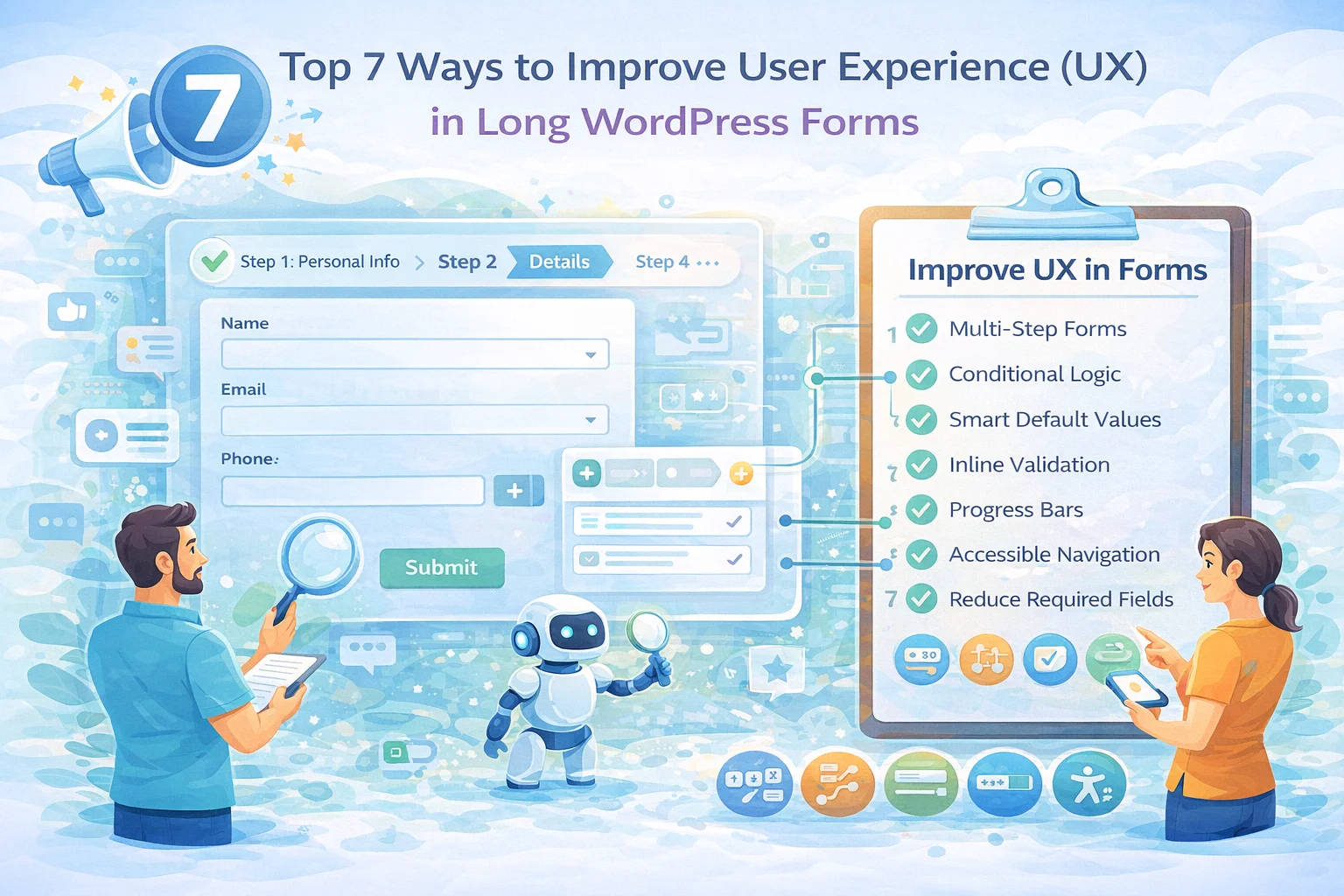
The single most impactful change you can make to a long form is to stop showing all of it at once. A form with 35 fields on a single page feels like a tax return. The same 35 fields distributed across 4 pages of 8-9 fields each, with a progress bar showing “Step 2 of 4,” feels manageable. The data collected is identical. The perceived effort is dramatically different.
Gravity Forms supports this natively through the Page field. Drop a Page field between sections to create a page break. Gravity Forms automatically adds Next/Previous buttons and can display a progress bar or step indicator at the top. Name each step clearly: “Personal Information,” “Employment History,” “Preferences,” “Review.” Users who know where they are and how much remains are significantly less likely to abandon.
Not every user needs to see every field. A form that asks “Do you have previous experience?” and then conditionally reveals the experience detail fields when the user selects “Yes” is perceived as shorter than a form that shows those detail fields to everyone, including the people who would leave them blank.
Gravity Forms’ conditional logic can show or hide individual fields, entire sections, pages, buttons, and notifications based on the values of other fields. A well-designed form might have 40 fields defined in the editor, but any individual user only sees 20-25 of them because the rest are hidden behind conditional rules that do not apply to their situation.
The key is to apply conditional logic liberally. Every optional section, every follow-up detail, every “if applicable” field should be behind a conditional rule. The form should start lean and reveal complexity only when the user’s answers indicate it is relevant.
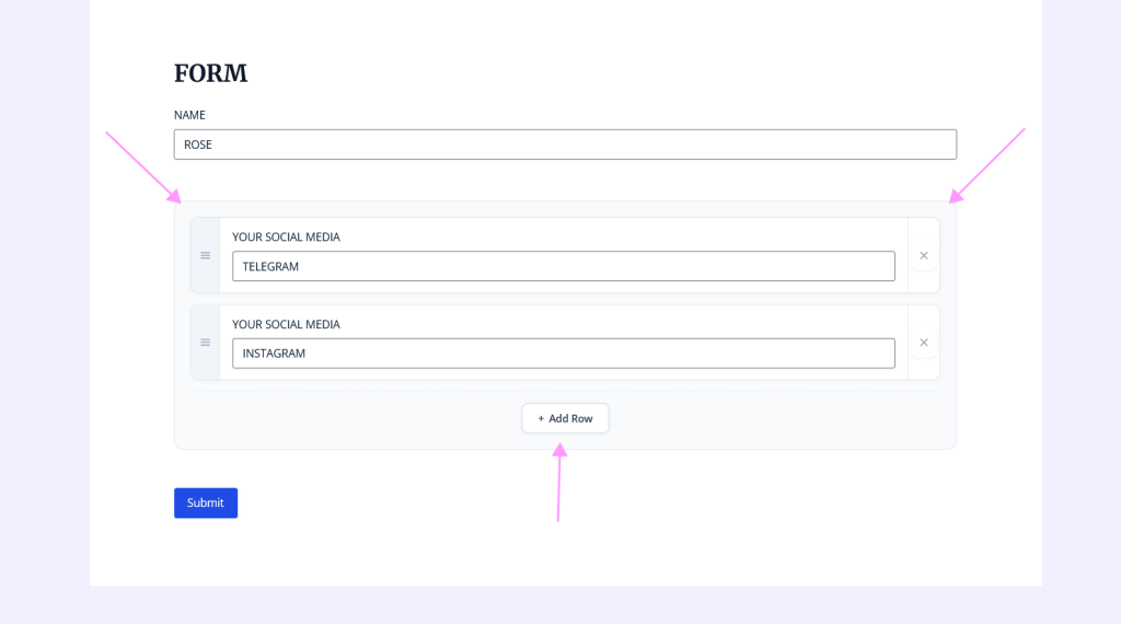
This is the technique with the single largest impact on long forms that collect variable-length data. Instead of pre-building 10 copies of a field group and hoping that is enough (while simultaneously making the form look enormous), use a repeatable section where users add rows as they need them.
A form that pre-loads 8 attendee sections for a group registration looks like it has over 40 fields, even if most users are only registering 2-3 people. The empty sections create visual clutter and cognitive load. A form with a repeater that starts with one attendee row and an “Add another attendee” button looks like it has 8-10 fields. The user registering 3 people adds 2 more rows. The user registering 8 people adds 7 more rows. Both see a form that matches their actual needs.
The NEXU Advanced Repeater plugin for Gravity Forms with dynamic expandable sections lets you define these repeatable sections using start and end markers in the form editor. Any Gravity Forms field type works inside: dropdowns, dates, numbers, file uploads. The form starts short and expands only when the user needs it to. This is the most effective way to make a variable-length form feel short without removing any data collection capability.
Nothing kills form completion motivation faster than filling out 30 fields, clicking submit, and seeing a wall of red error messages that scroll back to fields you completed ten minutes ago. Per-step validation catches errors while the user is still thinking about that section’s data, not after they have mentally moved on.
Gravity Forms validates required fields and format rules when users click the Next button on a multi-step form. This means errors are caught within the current step, and the user corrects them before moving forward. The experience is corrective (“fix this one thing”) rather than punitive (“here are 12 things you did wrong”).
For the best experience, keep validation messages clear and specific. “This field is required” is less helpful than “Please enter your email address.” “Invalid format” is less helpful than “Phone number should be in the format (555) 555-5555.” The more specific the error message, the faster the user corrects it, and the less frustration the form creates.
Long forms are not always completed in one sitting. A scholarship application might require gathering transcripts. An insurance form might need policy numbers from another provider. A group registration might require confirming details with other attendees. If the form does not save progress, users who leave lose everything and have to start over. Most will not.
Gravity Forms includes native Save and Continue functionality. When enabled, a “Save and Continue Later” link appears on the form. Users receive a unique URL that brings them back to the form with all previously entered data intact. They resume exactly where they left off. This single feature recovers form completions that would otherwise be permanently lost.
For forms that genuinely take more than 5 minutes to complete, save and continue is not optional. It is essential. A comprehensive job application, a detailed property assessment, or a multi-person registration with document uploads all fall into this category. Enable save and continue on any form where users might need to gather information from elsewhere before finishing.
Over 62% of global web traffic comes from mobile devices. Your long form will be filled out on phones. If you design it for desktop and hope it “works” on mobile, you are building for the minority of your users and neglecting the majority.
Mobile form UX has specific requirements that desktop forms do not. Tap targets need to be large enough for thumbs (at least 44×44 pixels). Multi-column layouts should stack into a single column on small screens. Dropdowns should use native select elements that trigger the device’s built-in picker. Progress indicators need to be visible without scrolling. And the “Add Row” button in repeatable sections needs to be easy to find and tap with one hand.
Test your form on a real phone before going live. Not a browser resize, not a device emulator. An actual phone in your hand, filling out the form the way your users will. Every friction point you discover and fix before launch is a user you do not lose after launch.
Every field you can pre-fill or default to the most common value is a field the user does not have to think about. This does not mean filling in data without the user’s knowledge. It means being smart about what you already know or can reasonably assume.
If the user is logged in, pre-fill their name and email from their WordPress profile. If the form is on a specific product page, pre-fill the product name. If your form asks for a country and 90% of your users are in the United States, default the country dropdown to “United States.” If a date field asks for a preferred start date, default it to the next Monday rather than requiring the user to click through a date picker from today’s date.
Gravity Forms supports dynamic population of field values from URL parameters, shortcode attributes, and PHP filters. For more advanced scenarios, population plugins can pull values from the current user profile, previous entries, or your WordPress database. Each pre-filled field removes a step from the user’s workload without removing information from your data collection.
Inside repeatable sections, smart defaults work per row. If a repeater row contains a dropdown that defaults to the most common selection, users who are adding multiple similar items only need to change the values that differ rather than starting from scratch on every row. This small detail significantly reduces the effort of adding multiple rows in a Gravity Forms repeater section with multiple dynamic rows.
Each technique is valuable on its own. But the real transformation happens when they are combined. Here is what a fully optimized long form looks like.
A form built this way has the same data collection capability as a massive single-page form with dozens of pre-built field groups. But it feels like four short, focused steps rather than one overwhelming page. Users who complete step 1 feel invested and continue. The progress bar motivates them through the middle steps. The repeater adapts to their specific needs. And save-and-continue catches anyone who gets interrupted.
Multi-step pages with progress bars (Page field), conditional logic for fields and sections, per-step validation, save and continue functionality, dynamic population from URL parameters and shortcode attributes, field default values, and responsive form layout. These cover techniques 1, 2, 4, 5, and part of 7.
The NEXU Advanced Repeater for Gravity Forms with UX-optimized repeatable sections provides the repeatable field group functionality that Gravity Forms lacks natively. It works seamlessly within multi-step forms, supports conditional logic inside repeated rows, and produces clean, structured entry data. This is the plugin that makes technique 3 possible without code.
Every abandoned form is a lost lead, a missed registration, or a customer who went to a competitor. The seven techniques in this guide do not require you to collect less data. They require you to present the same data collection in a way that respects the user’s time, attention, and device.
Multi-step structure gives users a sense of progress. Conditional logic removes irrelevance. Repeatable sections adapt to actual needs. Per-step validation catches errors early. Save and continue handles interruptions. Mobile-first design serves the majority of your users. And smart defaults reduce unnecessary typing.
None of these techniques are new or revolutionary. What is remarkable is how rarely they are all applied together. The forms that consistently achieve the highest completion rates are the ones that combine all seven, turning what could be an overwhelming data collection process into a guided, adaptive experience.
NEXU Advanced Repeater replaces field duplication with dynamic sections that adapt to each user. Forms start short and grow only when needed. From $19/year.






Okay, I'll admit I was skeptical when I saw "long forms can work" in the headline because let's be honest, most of us groan at the sight of a 30 field form. but this guide actually backs it up with real, practical tweaks that don't mean cutting corners on the data you need. The best part?
Hey everyone! i run a small blog reviewing WordPress tools, and this guide on improving long forms was a really helpful for me. I've always dreaded forms with 30+ fields they just feel like a chore but the tip about breaking them into sections with page breaks? pure genius. I tried it on my newsletter signup (which was way too long before), and suddenly more people actually finished it! Never thought a simple "Next" button could make that big of a difference. if you're sick of users dropping off halfway, check this out.
Hey everyone, just finished reading this and had to chime in. I've been putting together forms for our local fire station's volunteer signups, and I always assumed the shorter the form, the better. But that bit about how the form feels to the user really got me thinking turns out, our old 10 question form had a higher dropout rate than the new 20 question version we redesigned with clear sections and progress steps. Never would've guessed! This saved me from chopping fields we actually need just to keep it short.