Next-Level Code. Nexuvibe Style ...
Hrs
Min
Sec

Here is a number worth sitting with: mobile e-commerce traffic peaks between 8 PM and 11 PM. That is the window when most of your potential customers are lying on a couch, sitting in bed, or commuting home — phone in hand, room lights low or off, browsing products in an environment where a bright white screen is genuinely uncomfortable to look at for extended periods. And most WooCommerce stores greet every one of those customers with a full-brightness white background, blinding them at the exact moment they are most receptive to browsing and buying.
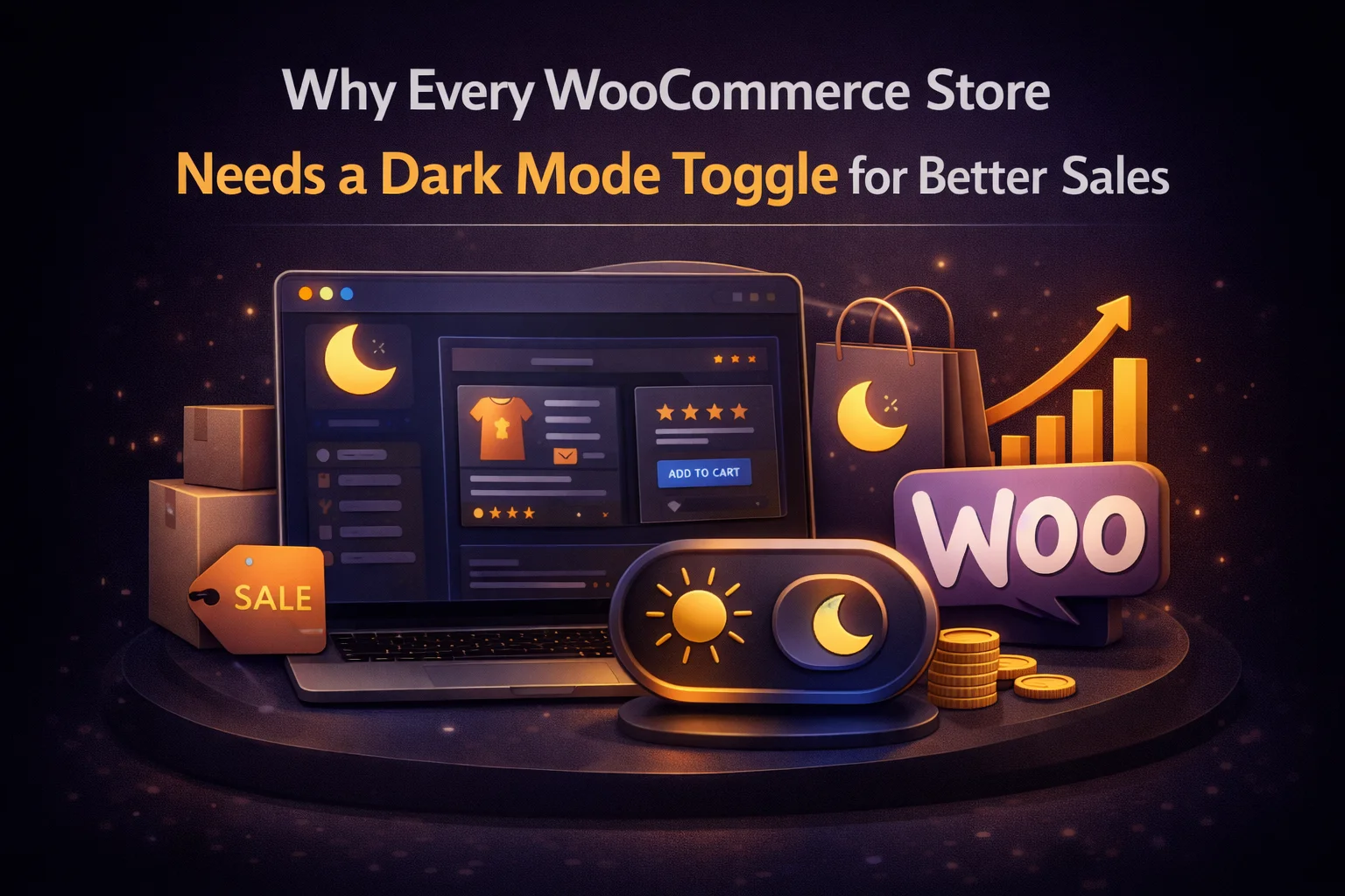
Dark mode for WooCommerce is not a cosmetic feature. It is a customer experience decision that affects how long shoppers spend browsing your products, how comfortable they feel reading product descriptions, and whether the discomfort of a bright screen causes them to close the tab before completing a purchase. The connection between visual comfort and conversion is not theoretical. Session data from mobile e-commerce consistently shows that users who are physically uncomfortable with a site’s visual experience leave faster and buy less.
There is, however, a critical caveat: WooCommerce dark mode done wrong is worse than no dark mode at all. A dark mode that inverts your product photos — turning carefully shot product images into color negatives — does not make your store more comfortable. It makes it look broken. A dark mode that flashes white on every product page navigation does not reduce eye strain. It amplifies it. The implementation quality for a WooCommerce store is not optional; it is the whole point.
This guide covers the sales case for WooCommerce dark mode, the specific requirements that make e-commerce dark mode different from blog dark mode, and how Nexu Eclipse — the WooCommerce-compatible dark mode plugin built for product image accuracy — handles each one.
Mobile commerce data is remarkably consistent across markets and product categories on one point: the highest-value shopping window is in the evening. Across the broad e-commerce market, mobile sessions peak between 7 PM and midnight, with the conversion rate peak falling between 9 PM and 11 PM — the hours when users are most relaxed, least distracted, and most likely to complete a purchase they have been considering during the day. Statista’s mobile commerce research consistently documents this evening concentration pattern across global markets.
These are also the hours when ambient lighting is at its lowest. A user browsing your WooCommerce store at 10 PM is almost certainly in a low-light environment. Their eyes are adjusted to that environment. The bright white background of a standard WooCommerce theme — typically in the 200 to 250 nits brightness range on a mobile screen — represents a significant luminance intrusion into their dark-adapted visual field.
The practical implication is direct: the customer segment that is most likely to complete a purchase on your WooCommerce store — the evening mobile shopper in a low-light environment — is also the segment most likely to be uncomfortable with a bright-background store and most likely to have dark mode preferences active on their device. Your store is currently asking this customer to override their OS preference and tolerate physical discomfort in order to buy from you. Some of them do. Many do not.
Consider the actual sequence: a potential customer opens your store at 10 PM in a dark bedroom, immediately experiences the white background as a jarring brightness intrusion, scrolls for a minute or two despite the discomfort, and closes the tab. They do not leave a review explaining why. They do not send feedback. They simply disappear from your analytics as a bounce or a short-session exit. You never know the purchase did not happen.
The conversion funnel for a WooCommerce store is a sequence of pages: homepage or category page, product listing, product detail, cart, checkout. Each transition is a point at which a customer can exit. Visual discomfort does not cause a single catastrophic abandonment — it creates a cumulative friction that increases exit probability at every step of the funnel.
E-commerce purchases often involve comparison browsing — a customer looks at multiple products, compares specifications, evaluates colors and sizes, and forms a purchase decision through accumulated exposure to your catalog. Each product page view is an opportunity to build the consideration that precedes a purchase. A customer who is squinting against screen brightness in a dark room has a shorter tolerance window for this process. They view fewer products, spend less time on each, and form weaker purchase intent before exiting. Dark mode extends the comfortable browsing window, which directly increases the average number of products viewed per evening session.
Product descriptions exist to answer the questions that prevent a purchase. Size guides, material details, usage instructions, care information, compatibility notes — all of it is written specifically to resolve the customer’s remaining objections. A customer who reads the full description is more likely to buy than one who skims the headline and gives up because their eyes are tired. Bright screens in dark environments accelerate reading fatigue. Dark mode maintains comfortable reading conditions long enough for the product description to do its job.
The checkout form is the highest-friction point in the purchase journey — it requires the customer to type, read field labels, review their order, enter payment details, and confirm multiple pieces of information. For a customer who is already experiencing eye fatigue from browsing a bright-background store for fifteen minutes, the additional cognitive and visual load of a checkout form is often the final straw. Baymard Institute’s cart abandonment research — the most cited dataset in e-commerce UX — consistently shows checkout UX friction as a primary abandonment driver. Cart abandonment is highest in the evening hours, and a portion of that abandonment is directly attributable to the physical discomfort of completing a form on a bright screen in a dark environment.
This is the point at which dark mode implementation quality becomes a sales-critical issue rather than a UX preference. In a physical retail store, a customer evaluates a product by handling it — feeling the material, examining the color, assessing the build quality. In an online store, the product photograph is the entire sensory experience of the product. It is the only tool the customer has to form a judgment about whether this is what they want.
A dark mode that inverts product images — displaying a blue jacket as an orange jacket, a white ceramic bowl as a black one, a green plant as a purple negative — does not just look wrong. It actively misleads the customer about what they are buying. The customer either abandons because they cannot evaluate the product correctly, or worse, they buy based on inaccurate visual information and return the product because the color was nothing like what they saw on screen.
Nexu Eclipse protects all images and media from dark mode color transformations by default. Product photographs, gallery images, variant swatches, and zoom-capable product shots all display exactly as they do in light mode. The dark mode affects the interface — the background, the text, the navigation, the product cards, the checkout form — without touching the images that inform the customer’s purchase decision. That distinction is precisely what a WooCommerce store requires.
A blog and a WooCommerce store have different dark mode requirements. The elements that make an e-commerce experience work — product cards, price displays, buttons, form fields, trust badges, payment icons — all require specific consideration when designing a dark theme. Here is what WooCommerce dark mode must handle correctly that generic implementations typically miss.
Price elements — regular price, sale price, savings amount, and discount percentages — are critical conversion elements. In dark mode, these need to maintain their visual hierarchy and remain immediately readable. Sale prices displayed in a faint grey on a dark background lose the urgency that makes them conversion drivers. Your dark mode palette needs to preserve the emphasis on price information, not flatten it into the same visual weight as surrounding text.
Call-to-action buttons are the single most important conversion elements on a product page. In dark mode, they need to remain visually prominent — not fade into the dark background or become indistinguishable from secondary actions. WooCommerce themes typically style these buttons with high-contrast colors (green, orange, a strong brand color) against light backgrounds. In dark mode, those same buttons may need adjusted styling to maintain the same visual weight. This requires a dark mode implementation with color control granular enough to handle button accent colors specifically.
Visa, Mastercard, PayPal, Stripe badges, SSL certificates, and money-back guarantee logos are trust signals that reduce purchase anxiety. Most of these logos are designed for light backgrounds — white-background card logos look fine on a light checkout page and look wrong or invisible on a dark one. These elements need to be excluded from dark mode transformation or handled with special care to ensure they remain legible. A checkout page where the payment logos have disappeared is a trust-damaging user experience at the worst possible moment.
Form input fields require careful handling in dark mode. Input backgrounds that are too dark make it difficult to see typed text. Input borders that are too faint make field boundaries ambiguous. Error states — the red highlights that appear when a required field is missed — need to remain clearly visible against dark backgrounds. A dark mode that makes the checkout form harder to use is directly contributing to cart abandonment at the final step. Form field styling in dark mode is an area where the granular color control of a quality implementation pays off directly.
The configuration process for a WooCommerce store has some specific steps beyond the standard dark mode setup. Work through these after completing the general configuration described in the setup guide.
Navigate to the Exclusions settings in Nexu Eclipse and confirm that img, .woocommerce-product-gallery__image, and .wp-post-image are protected from color transformation. Then navigate to a product page in dark mode and verify that each product image, gallery thumbnail, and zoom-view displays in accurate colors. Do this for products with a range of colors — white, black, and brightly colored items are the most obvious failure cases if something is misconfigured.
Add a product to cart, switch to dark mode if it is not already active, and work through the entire checkout process. Look for: form field visibility (can you read the placeholder text and typed input clearly?), button visibility (are the Add to Cart, Proceed to Checkout, and Place Order buttons clearly visible?), error state visibility (trigger a validation error on a required field — is the error message readable in dark mode?), and payment icon display (are your payment method logos visible?). Any failures here need to be addressed via exclusions or color adjustments before dark mode goes live.
For a WooCommerce store, the ideal toggle placement is in the header near the navigation — visible on every page without competing with the Add to Cart button for attention. A floating toggle in the corner is a secondary option. What you want to avoid is a toggle that is visible on the home page but disappears on product or checkout pages because of template overrides or theme conflicts. Test toggle visibility on the homepage, a category page, a product detail page, the cart, and the checkout. It should be consistently present throughout the purchase journey.
Locate your payment logos, SSL badge, money-back guarantee graphic, and any other trust-signal images. Add their CSS selectors or parent container selectors to your exclusions list. Navigate to the checkout page in dark mode and verify each trust signal is visible and legible. If your payment logos appear as white-on-dark squares (i.e., the logo SVG or PNG has a white background that is now invisible against your dark checkout), you may need to add a background color to those elements via CSS or ensure the containing element has appropriate styling in dark mode.
There is a softer argument for WooCommerce dark mode that is worth making explicitly: the presence of a well-implemented dark mode toggle is itself a trust signal. It communicates that your store pays attention to customer experience beyond the transactional minimum. Customers who notice it — and the segment most likely to notice it is the exact segment that uses dark mode, meaning your tech-forward, detail-oriented, high-lifetime-value customers — read it as evidence of a store that cares about their experience.
This is not a universal argument. Most customers will never consciously think about the dark mode toggle. But the subset who use dark mode regularly and who encounter a store that has it implemented well — flash-free, image-accurate, consistent throughout the purchase journey — will notice. The contrast with stores that lack it, or that have it broken, creates a positive differentiation at the quality perception level that contributes to brand preference and repeat purchase behavior.
Conversely, a broken dark mode — one that a customer enables and finds makes their product images look wrong, or flashes white on every page navigation — is a trust-damaging experience. It tells the customer that the store does not test its features, does not think about its customers’ experience carefully, and may not be the most reliable place to spend money. A broken dark mode is worse than no dark mode. Implementation quality is the difference between a trust asset and a trust liability.
A WooCommerce store that passes every item on that checklist has done something most online stores have not: it has made its most valuable shopping window — the evening hours when purchase intent is highest and visual comfort matters most — genuinely comfortable for the majority of mobile shoppers. That is not a minor feature addition. It is a meaningful competitive advantage in the window where your customers are most ready to buy. Nexu Eclipse — the WordPress dark mode plugin designed for WooCommerce product accuracy and evening shopper comfort — is built to deliver exactly this, out of the box.
Nexu Eclipse protects product images from inversion, maintains checkout usability, keeps trust badges visible, and delivers a flash-free experience to every evening shopper who arrives with OS dark mode active. This is WooCommerce dark mode that actually serves the purchase journey.








Finally a plugin that gets nighttime shoppers. my sales jumped after adding this.
Okay, so I grabbed this dark mode plugin for my WooCommerce site since I figured most people shop on their phones at night, and a bright screen is just harsh. And honestly, it does the job no more getting blinded by a white background when customers browse my store after dark.
I was totally skeptical about adding dark mode to my shop at first, but wow, the difference is night and day (pun very intended). My evening sales have actually gone up since installing this no joke! The toggle works super smooth, and unlike some other plugins I've tried, it doesn't make my site look all glitchy or broken. definitely worth it for keeping my customers happy (and not squinting at their screens at midnight).