

Mobile e-commerce traffic has surpassed desktop in almost every market. According to Statista, mobile devices account for roughly 60% of global e-commerce traffic and the share continues to grow. Yet mobile checkout completion rates consistently lag behind desktop. The gap is significant: mobile conversion rates are typically 1.5 to 2 percentage points lower than desktop, even on the same store.
The reason is straightforward. Most WooCommerce checkout pages were designed for desktop first and then made “responsive” for mobile. Responsive means the layout fits on a smaller screen. It does not mean the experience is good on a smaller screen. A form with 15 fields that looks manageable on a 27-inch monitor becomes an endless scroll on a 6-inch phone. Typing on a touchscreen keyboard that covers half the screen is slower and more error-prone than typing on a physical keyboard. Tiny checkboxes and narrow dropdown arrows become frustrating tap targets for thumbs.
This guide covers the specific changes you can make to your WooCommerce checkout fields and layout to improve the mobile experience. Most of these changes also benefit desktop users, but they are critical for mobile because that is where the gap between potential and actual conversions is largest.
Why mobile checkout is harder than desktop checkout
Before we get into solutions, it is worth understanding exactly why mobile checkout is more difficult. This is not just about screen size. There are five specific factors that make completing a checkout form on a phone meaningfully harder than on a computer.
Touchscreen keyboards are smaller, have no physical feedback, and the autocorrect system fights the customer on addresses, email addresses, and proper nouns. Every text field on mobile takes roughly 3 to 5 times longer to complete than on desktop. This means each field you remove saves mobile customers 15 to 30 seconds of frustrating thumb-typing.
When the virtual keyboard opens on a phone, it covers the bottom 40 to 50% of the screen. The customer can only see the field they are currently typing in and maybe one or two fields above it. They lose context about where they are in the form and how much is left. This creates an anxiety loop: “How many more fields are there?” that accelerates abandonment.
On desktop, side-by-side field pairs (first name | last name) reduce the perceived height of the form. On mobile, those fields stack vertically. A 15-field form that fits in two screen heights on desktop becomes 6 or 7 screen heights on mobile. The customer has to scroll past their entire form to see the order summary and the submit button.
Checkboxes, radio buttons, and dropdown arrows that are perfectly clickable with a mouse cursor become difficult tap targets for a thumb. Mis-taps are common and frustrating. A customer trying to check a “Gift wrap” checkbox who accidentally taps the wrong element feels a friction that erodes their commitment to completing the purchase.
Phone notifications, incoming calls, text messages, and the temptation to switch to another app are all competing for the customer’s attention while they fill in your checkout form. Every second your form takes to complete is another second where a notification might pull them away. A shorter, faster form has a better chance of being completed before the inevitable distraction arrives.
Practice 1: Reduce field count aggressively for mobile
If removing unnecessary fields is important on desktop, it is critical on mobile. Every field you eliminate from your checkout form saves a mobile customer 15 to 30 seconds of thumb-typing and one full screen height of scrolling. The impact compounds: removing 3 fields can shorten the mobile checkout experience by over a minute and reduce the visible form length by 3 screen heights.
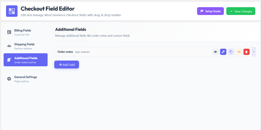
Start with the fields that add the least value: Company Name, Address Line 2, and Order Notes. If you do not call customers, consider removing the phone number field entirely. Each of these removals is a single click with a visual WooCommerce checkout field editor with toggle-based field management. The field is disabled but not deleted, so you can bring it back if you change your mind.
A checkout form with 12 fields requires approximately 7 to 8 screen heights of scrolling on a typical smartphone. Reduce that to 8 fields and the form fits in about 4 to 5 screen heights. That is nearly half the scrolling eliminated. The customer reaches the submit button faster, with less fatigue, and with less opportunity to be distracted or discouraged.
Practice 2: Use conditional logic to minimize visible fields
Conditional logic is even more valuable on mobile than on desktop. On desktop, a few extra hidden fields do not dramatically change the visual impression of the form. On mobile, every field that is hidden from the initial view saves an entire screen height. The difference between a 6-field form and a 10-field form is the difference between a form that feels manageable and one that feels overwhelming on a phone.
Hide shipping address fields when the customer selects “Local Pickup.” Hide gift fields until the customer checks a “This is a gift” box. Hide business-related fields until the customer indicates a business purchase. Each of these conditions keeps the mobile form at its minimum length for each individual customer.
Practice 3: Use smart field types that minimize typing
On mobile, tapping is always faster than typing. Every place you can replace a text input with a tap-based interaction (dropdown, radio button, checkbox, date picker) saves the mobile customer from opening the keyboard, typing a response, dealing with autocorrect, and closing the keyboard. That keyboard open/close cycle alone adds friction that accumulates across the form.
Practice 4: Move email to the first field position
This recommendation appears in almost every checkout optimization guide, but it is especially important for mobile. Mobile customers are more likely to be interrupted and abandon the form partway through. If the email field is the first field on the form, you capture it immediately. If the email field is the eighth field and the customer quits after the fifth, you have no way to follow up.
The email address is the key to abandoned cart recovery. A customer whose email you captured can receive a recovery email within a few hours. A customer whose email you did not capture is gone permanently. On mobile, where abandonment rates are higher, having the email captured early is proportionally more valuable.
Practice 5: Use per-product fields to avoid global bloat
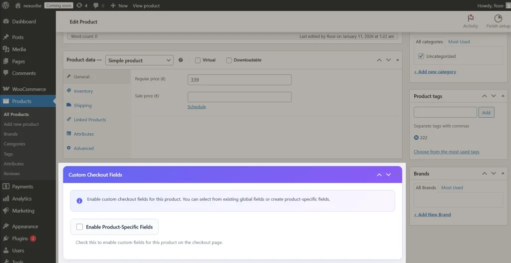
On desktop, a few extra conditional fields add moderate visual weight to the form. On mobile, every additional field adds a full screen height of scrolling. If your store sells both standard and customizable products, adding customization fields to the global checkout (even with conditional logic to hide them for most products) creates a risk: if the conditions fail, if caching serves a stale page, or if JavaScript does not execute properly on a particular mobile browser, the customer sees all the fields.
Per-product checkout fields eliminate this risk entirely. The customization fields are only loaded when their specific product is in the cart. They do not exist in the page markup for other products, so there is no possibility of them appearing incorrectly. The mobile checkout form is always exactly the right length for each specific order.
Practice 6: Enable mobile payment methods
Apple Pay, Google Pay, and other mobile wallet payment methods are the single biggest mobile checkout accelerator available. They allow customers to pay with a face scan or fingerprint instead of manually typing a 16-digit card number, an expiration date, and a CVV on a tiny keyboard. The card number entry alone takes 30 to 60 seconds on mobile. Apple Pay replaces that entire process with a single biometric confirmation.
Most WooCommerce payment gateways support Apple Pay and Google Pay. WooCommerce Payments, Stripe, and PayPal all offer mobile wallet integration. If you have not enabled these options, you are asking mobile customers to manually enter payment information that their phone already has stored securely. Check your payment gateway settings and enable every mobile wallet option available to you.
Practice 7: Test your checkout on a real phone
This sounds obvious but almost nobody does it. Store owners and developers test their checkout pages on desktop browsers, sometimes using browser DevTools to simulate a mobile viewport. That simulation shows layout issues but it does not reveal the actual experience of filling in the form on a real phone.
Take your phone, open your store, add a product to the cart, and go to checkout. Fill in every field with real data. Feel how long it takes. Notice the keyboard blocking your view. Experience the scrolling. Try to tap the checkboxes. Attempt to select a dropdown option. Try to read the error messages if you intentionally leave a required field blank. This 5-minute exercise will reveal more about your mobile checkout experience than any analytics dashboard.
Can you complete the form in under 2 minutes? Can you see the field you are typing in when the keyboard is open? Can you tap every checkbox and radio button on the first try? Can you read the field labels clearly? Does the form fit on your screen without excessive scrolling? If the answer to any of these is no, you have work to do.
A mobile-first summary
Mobile checkout optimization is not a separate project from desktop checkout optimization. It is the same project, with higher stakes. The changes that make your checkout better on mobile also make it better on desktop. But the impact is proportionally larger on mobile because that is where the friction is highest, the patience is lowest, and the conversion gap is widest.
The NEXU WooCommerce checkout field editor with field toggling, conditional logic, per-product fields, and drag-and-drop reordering gives you every tool you need to implement practices 1 through 5 without code. Enable mobile wallets through your payment gateway settings. And then test the result on your phone. That is the complete mobile checkout optimization playbook.
Build a mobile checkout that converts like desktop
Remove unnecessary fields, use conditional logic to minimize form length, assign per-product fields to avoid global bloat, and reorder fields for maximum mobile efficiency.




I picked up this guide because I was really hoping it'd help me fix the disaster that is mobile checkout on my site. Yeah, the stats about conversion drops are spot on I see the same thing in my analytics every day but the tips here are pretty surface level. telling me to "make it responsive" doesn't cut it when half my customers are struggling to tap the right fields on their phones. i was looking for real, actionable solutions, not just "take your desktop form and make it smaller
This guide totally nailed it mobile checkouts aren't just tiny desktop versions. that 1.5 2% conversion gap really hit home after I saw our own mobile drop offs
Hey everyone! my friend swore by this guide after her mobile sales jumped, so I gave it a shot. The part about touchscreen keyboards covering half the screen hit home so true! my customers kept complaining about typos in their shipping info. the tips here actually made my checkout feel less clunky on phones. Still tweaking a few things, but already seeing fewer abandoned carts. Worth the read if mobile's killing your conversions!
Those tiny checkboxes kept messing up my checkout. Make them easier to tap