Next-Level Code. Nexuvibe Style ...
Hrs
Min
Sec

Most customers do not arrive at a wallet page because they love your brand architecture. They arrive because a promotion, a refund policy, or a checkout shortcut nudged them toward stored value. At that moment, the mental model is simple: “If I put money here, can I get it back, spend it predictably, and understand what happened if something goes wrong?” The WooCommerce documentation on managing orders and customer-facing records reinforces a broader commerce truth people rarely articulate: customers expect parity between what they paid, what they received, and what your systems display. Wallets amplify that expectation because the balance is liquid—it feels spendable even when policy treats it as conditional.
Operators who implement wallet experiences without revisiting My Account navigation often discover a second problem: customers cannot find the page when they need it most. A wallet tab buried under “Points,” “Rewards,” and “Gift cards” increases support load more than a slightly imperfect design ever will. The practical standard is discoverability plus legibility. If your storefront already runs WooCommerce, pairing a deliberate wallet surface with a product like Nexu WP’s WooCommerce store credit wallet with My Account balance cards for regular customers gives you a coherent place to anchor explanations, top-ups, and ledger history without inventing parallel URLs that SEO and email teams forget to maintain.
Shoppers do not distinguish cleanly between “wallet balance,” “store credit issued from a return,” and “cashback pending approval.” They see a number beside their name and assume it behaves like cash until proven otherwise. That assumption is neither naive nor malicious; it is how human brains compress complexity when they are busy. Your job in My Account is to slow the story down just enough to be accurate without sounding adversarial. That means naming the balance type, showing any pending segments, and linking to a plain-language policy page that matches what your checkout actually enforces.
Expectations also include timing. If a customer tops up on mobile during a commute, they expect the funded amount to appear before they reopen the cart—not after a cron job runs overnight. If you rely on asynchronous crediting, say so at the moment of payment, not buried in legal text. The gap between “charged” and “usable” is where chargebacks and angry tweets concentrate. Teams that run configurable wallet top-up rules for prepaid shopper workflows in WooCommerce can align messaging with mechanics: minimum increments, maximum stored value, eligibility by role, and whether guest checkout can ever receive credit. Those knobs are not cruelty; they are clarity. Customers accept limits when limits read as consistent rules rather than surprises at checkout.
Finally, customers expect parity between marketing promises and account reality. If your homepage says “instant store credit,” My Account must not show a different label like “loyalty liability” without explanation. Consistency is a conversion tool and a dispute shield. When marketing and product disagree, customers choose the interpretation that benefits them—and regulators often agree. The Federal Trade Commission’s business guidance on advertising and marketing truth-in-practices expectations is a blunt reminder that stored-value promotions are still promotions. Treat wallet UI as part of your advertising stack, not a siloed engineering artifact.
If you are still drafting policy, write the customer-facing paragraph first, then implement software constraints to match. Reversing that order is how teams ship clever wallet mechanics that nobody can explain on a live chat.
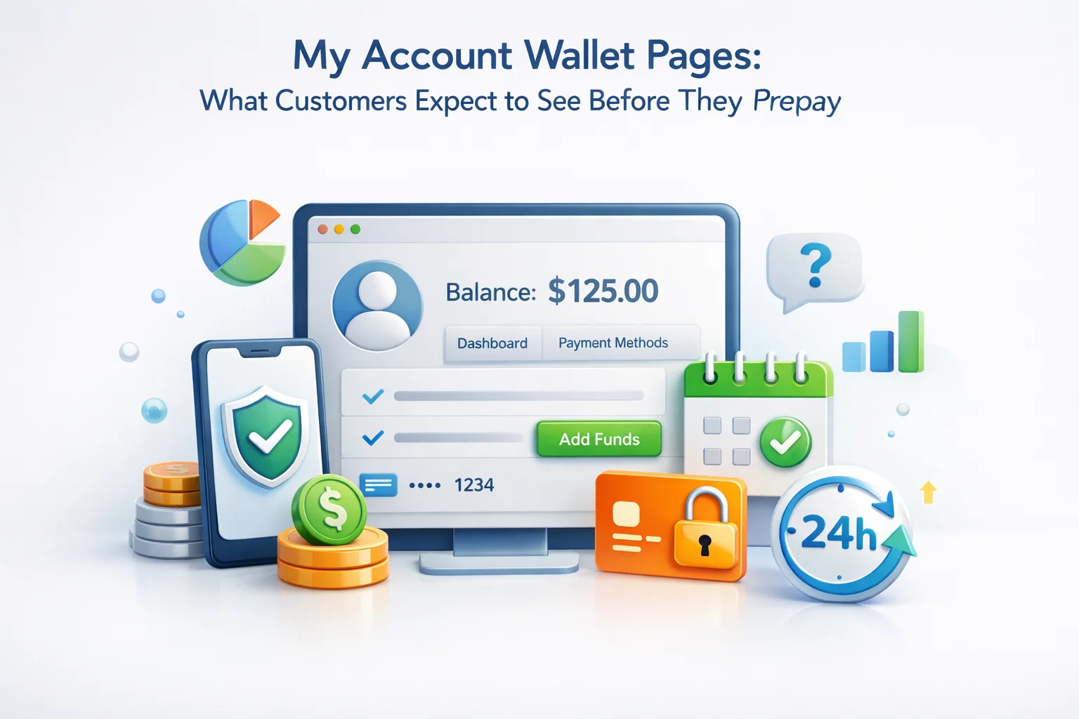
Clarity begins with typography hierarchy, not with feature count. A wallet page should answer four questions above the fold: what is spendable now, what is pending, what changed recently, and what to do next. Secondary questions—tax treatment, cross-border currency, expirations—belong in expandable sections with stable anchors your support macros can link to. If your store sells internationally, show the settlement currency explicitly. Silent conversion math is a trust killer when exchange rates move between cart sessions.
Holds deserve special treatment because they look like theft when explained poorly. If you place a hold during fraud review, say “under review” with an expected SLA range, not “processing” forever. If you place a hold because a payment gateway disputed a prior top-up, your customer service training must include the exact script that references order IDs without leaking internal tool jargon. The WordPress advanced administration guidance on hardening and operational security is not wallet-specific, but it frames why sensitive actions belong behind strong authentication and rate limits—details customers feel as “this site takes money seriously.”
If you expose multiple wallets or sub-ledgers, add a legend. People can learn unfamiliar models when you teach once and repeat consistently across email, SMS, and My Account. What they cannot tolerate is a different definition per channel.
Prepayment is an emotional transaction even when the math is small. Customers ask subconscious risk questions: Can I undo this? Will my card be saved without consent? Will my employer see a weird merchant descriptor? A top-up flow should read like a receipt generator, not a dark pattern funnel. Confirm the amount twice on high-friction screens: once as a bold number, once as a sentence “You are adding $50.00 to your store wallet.” Provide an explicit cancel path that returns to My Account without losing context.
Payment method presentation matters. If you reuse WooCommerce gateways, inherit their trust marks and error handling rather than wrapping them in custom iframes that strip context. After success, show a ledger line immediately—even if the background job is still finalizing ancillary metadata. Customers anchor trust on the first screen after payment. A blank “success” toast followed by an unchanged balance is how rumor mills start. Teams implementing a storefront wallet funding flow that pairs partial payments with store credit on checkout should rehearse edge cases aloud: split payment with wallet plus card, failed card after wallet debit, subscription renewal attempts when wallet covers only part of the total. Each scenario needs a sentence on the top-up confirmation page or an adjacent help drawer.
Finally, log the customer out and back in on staging after a top-up. Session edge cases are boring until they are expensive. A wallet that renders correctly for an admin impersonation session but not for a fresh customer cookie is a launch blocker, not a polish item.
History is where abstract balances become stories. Customers scan for verbs: topped up, spent, refunded, adjusted, expired, transferred. If your ledger lines read like database rows, you will train people to open tickets for translation. Good descriptions name the order when one exists, name the promotion when one applies, and separate operator adjustments with a neutral tone. “Balance correction after gateway reversal” beats “Admin change.” The former sounds like a system event; the latter sounds like someone edited your money at lunch.
Pagination and filters are not luxuries for busy accounts. Let shoppers isolate credits versus debits, search by order number, and export a CSV when your B2B buyers need internal reimbursement paperwork. Export is a retention feature for prosumers; without it, they photograph your screen and email finance departments who do not know your brand story. If you centralize wallet logic with a WooCommerce wallet plugin for cashback grants, debits, and customer-facing ledger clarity, treat exports as part of the launch checklist alongside accessibility and mobile layout.
Disputes are inevitable; confusion is optional. When a customer escalates, your agent should be able to read the same ledger ordering the customer sees, with the same timestamps. If admin views sort differently, you will argue about reality instead of solving the problem.
“Available balance” is a contract in two words. If you do not cash out to bank accounts, say so plainly before customers fund the wallet. If refunds always return to wallet first for operational reasons, explain the hierarchy and the timeline for optional cash-out where permitted. Mixed models—wallet for convenience, original payment method for compliance—require even tighter copy because customers remember the exception that helped them once and assume it is universal.
Policy tables belong in help centers, but My Account should still surface the two rules that prevent 80 percent of tickets: how refunds route, and whether wallet funds expire. Expiration is emotionally charged; if legally allowed in your jurisdiction, show the next expiration date next to the balance summary, not only in PDF terms. Silence reads as trickery even when your intentions are fine.
If you offer withdrawal requests, publish SLAs and statuses customers can track. “Requested,” “approved,” “sent,” and “failed” are minimum viable states. Support should never be the only place a failed payout is visible.
Customers cannot audit your code, so they audit signals: HTTPS, recognizable gateways, sane session timeouts, and friction appropriate to risk. Wallet pages should not preload excessive personal data on shared devices. Offer a “log out everywhere” link near wallet actions if your threat model includes household devices. Encourage passkeys or two-factor authentication with calm copy that explains wallet theft is irreversible in the same way cash theft is—because spend happens fast.
Rate limiting and anomaly alerts are invisible when they work; customers only notice security when it fails. Still, you can surface benign assurances: “We emailed you about this login,” “This top-up was initiated from Chrome on Windows near your usual city.” Those messages must be accurate and privacy-law compliant, but when done well they reduce panic without sounding creepy. Behind the scenes, mature teams keep a tight secure-coding checklist for authentication, sessions, and payment endpoints so customer-visible cues stay aligned with what engineering actually ships.
Never store CVV or gateway secrets in WordPress options tables. If a contractor proposes “quick wallet hacks,” reject them on architectural grounds. Stored value concentrates fraud incentives; your My Account surface should feel boring and bank-like on purpose.
More than half of wallet interactions happen on phones for many catalogs, especially when a customer tops up in response to a cart reminder email. Mobile layouts should enlarge numeric balances, widen buttons, and avoid hover-only tooltips. Payment handoffs to external banking apps should preserve return URLs and show a “return to store” instruction when OS webviews behave badly. Test on mid-tier Android devices, not only flagship iPhones; wallet bugs cluster around webview memory limits and third-party keyboard autofill quirks.
Thumb reach matters for destructive actions. Confirmation modals should require explicit reading: repeating the amount, requiring typed confirmation only for unusually large top-ups if your risk team wants that guardrail. Autoscroll to errors near the payment form; do not strand errors at the top of a long page while the customer stares at a disabled button. The WCAG 2.2 quick reference from the W3C Web Accessibility Initiative is the standard baseline for contrast, focus order, and target size—details that directly affect whether wallet tasks are completable on a bus ride.
If you use progressive web app shells or aggressive caching, exclude wallet balances from stale caches. Nothing erodes trust faster than a ghost number that snaps to reality after a hard refresh.
Support macros should mirror My Account language verbatim. If agents say “promotional credit” while the UI says “wallet funds,” you manufacture cognitive dissonance under stress. Build an internal playbook with screenshots tied to release versions, not living documents that drift. Include escalation paths for payment disputes, fraud holds, and engineering toggles your night shift must never flip casually. Wallet incidents are time-sensitive; define who owns comms to affected customers when a gateway incident blocks top-ups.
Link to ledger lines, not dashboards customers cannot see. Quote the customer-visible transaction ID. If a bug exists, acknowledge it once with a ticket reference rather than debating reality.
Quarterly, run “wallet war games”: partial refund after split payment, failed renewal, mistaken admin adjustment. Grade agents on whether they can explain outcomes without engineering help.
If checkout or wallet funding depends on a gateway, tie public incidents to wallet-specific banners so customers do not guess whether “checkout down” includes top-ups.
Product marketing should participate in support listening weekly during wallet launches. The phrases customers repeat are the phrases your UI should adopt. If people say “my prepaid money vanished,” your ledger copy failed, not your arithmetic.
Closing the loop, My Account wallet pages succeed when they respect the shopper’s imagination: stored value is still money, just routed through your rules. Make those rules legible, make history narrate reality, and make top-ups feel as reversible as policy allows. For WooCommerce teams standardizing that experience without rebuilding checkout from scratch, Nexu WP’s Smart Wallet and Cashback plugin for WooCommerce with customer My Account surfaces is built to keep wallet behavior, ledger clarity, and admin controls aligned so expectations stay synchronized from first prepayment to the hundredth repeat order.
Ship wallet UI the way you ship payments: with rehearsals, observability, and language that could survive a screenshot posted publicly. Calm customers prepay again; confused customers churn silently after one refund.
Smart Wallet and Cashback connects storefront funding, partial payments, cashback, and customer-visible history inside WooCommerce—so prepayment feels intentional, reversible, and easy to support.







Finally got around to setting this up for our pharmacy's refill subscriptions. The timing labels are exactly what patients need no more "where's my credit?" calls because "pending" and "available" are crystal clear now. Even my tech averse staff stopped asking me how to explain balances. Saved us hours in support already.
The wallet labels are actually clear "available," "pending," and "non withdrawable" all have simple explanations. No more guessing what's ready to spend or stuck in limbo. Definitely saved me a support ticket
What does "available" mean vs "pending"?
Hey, the wallet top up flow is clean but the confirmation step feels buried.