Next-Level Code. Nexuvibe Style ...
Hrs
Min
Sec

There is a particular kind of blindness that afflicts almost every WordPress site owner, no matter how experienced. You publish content. You add links. You run keyword research. You look at rankings in Google Search Console and wonder why certain pages are not climbing. You check your backlinks. You optimize your titles. And all the while, the actual structural problem — the shape of how your content connects to itself — remains completely invisible because you have never had a way to see it.
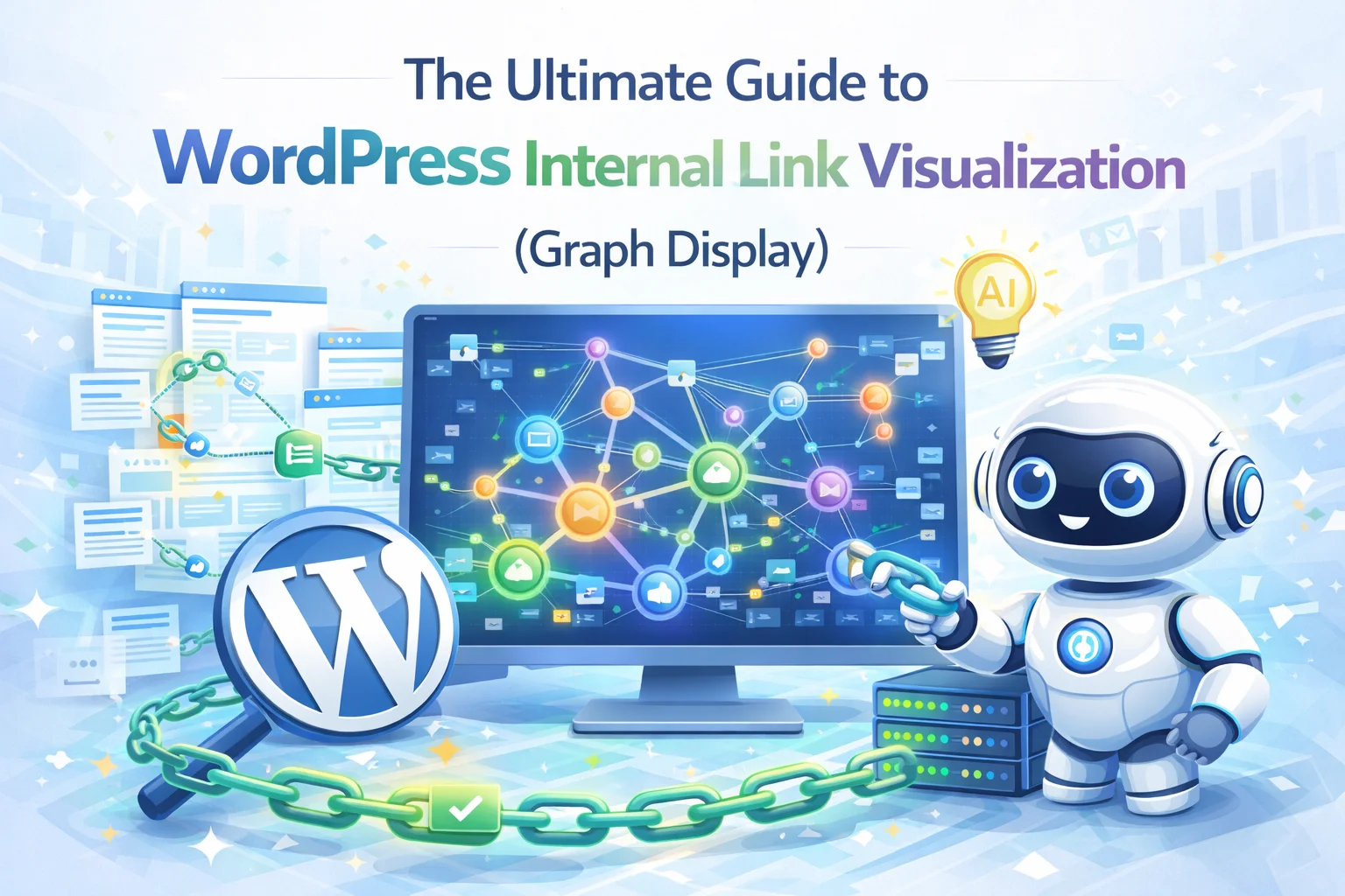
Internal link visualization changes this. When you render your site’s link structure as an interactive graph — every post a node, every internal link an edge — you see things that spreadsheets, audits, and years of manual SEO work never surface. You see which content clusters are genuinely connected and which ones are isolated islands. You see the pages that function as unexpected structural hubs. You see the posts that have been effectively orphaned by gradual neglect. You see the asymmetry in how link authority flows across your site. And you see all of it simultaneously, in a single view, in a way that makes action immediately obvious.
This guide covers what internal link graphs actually show you, why the insights they reveal are structurally important for SEO, how to read and interpret a graph of your own site, and how tools like Nexu Automated AI Internal Linker make this kind of visibility native to your WordPress workflow rather than something you have to engineer externally.
By the end of this guide, you will understand your site’s link architecture in a way that most SEO practitioners simply do not — and you will have a clear framework for using that understanding to drive rankings.
The reason internal link structure stays invisible for so long is that nothing in a standard WordPress workflow forces you to look at it holistically. You see posts in a list. You see individual pages in an editor. You see backlink counts in a rank tracker. But you never see the topology of how everything connects — the shape of the network — because none of those tools render it spatially.
This matters for a specific reason that is worth stating directly: search engines do not experience your site as a list of posts. They experience it as a graph. Googlebot follows links. It builds a model of your site by traversing connections. The importance it assigns to any given page is determined significantly by how many relevant pages link to it, what anchor text those links use, and how directly those source pages connect to other important content on the site. The entire PageRank algorithm — at its core — is a graph algorithm. Your site’s rankings are, in part, a function of its graph structure.
When site owners optimize without seeing the graph, they are making decisions about a structure they cannot see. They add links to pages they remember. They use anchor text that comes to mind. They publish new content without considering how it integrates into the existing network. Over time, the graph that results from these decisions is rarely the graph they would have built if they could see it — and the ranking results reflect that gap.
The other reason structural invisibility is damaging is that it makes problems accumulate silently. A site that publishes consistently but links inconsistently does not look broken in any conventional audit. Pages are indexed. Rankings exist. Traffic flows. But underneath, the structural inefficiency compounds month by month — older content losing incoming links as newer content accumulates them, certain topic clusters becoming internally dense while others remain disconnected, key commercial pages receiving far less link equity than their business importance justifies. None of this appears in a keyword ranking report. All of it appears instantly in a well-rendered link graph.
The graph does not just diagnose. It prioritizes. When you can see which isolated pages are topically most valuable, which clusters need bridging connections, and which hub pages are underutilized, you have a ranked action list that no spreadsheet audit could produce with equivalent clarity. This is what changes when visualization becomes part of your SEO workflow.
Every link graph, regardless of what site it represents, tends to show the same set of structural patterns. Learning to recognize them is the foundation of turning a visual tool into a strategic one. Once you can name what you are looking at, the right action for each pattern becomes straightforward.
An isolated node is a post or page with no incoming internal links — or only one. It appears in the graph as a dot with no connections, floating at the periphery of the visualization. These are your orphan pages, and on sites with more than 100 posts, they are almost always more common than the site owner expects. Isolated nodes receive no link equity flow from the rest of the site. Googlebot may find them eventually via the sitemap, but they carry no structural authority. The fix is targeted incoming links from topically relevant content — and the graph tells you exactly which pages would be most valuable sources.
A dense cluster is a group of posts that all link to each other — a tightly interconnected topic area. On its own, this is healthy. The problem appears when two or more of these clusters exist on the same site with no links connecting them. Each cluster circulates authority internally but does not share it with the other topic areas. This is an extremely common pattern on sites that publish across multiple topic categories without deliberate cross-linking. The fix is identifying posts in each cluster that have genuine thematic overlap with posts in the adjacent cluster, and building a bridge. A single well-placed bridge link between clusters dramatically changes how authority flows across the whole site.
In most link graphs, a small number of pages accumulate a disproportionate number of incoming links from the rest of the site. These hub pages appear as large nodes at the center of connection clusters. What surprises most site owners is which pages are the hubs. Often they are not the pages with the highest traffic or commercial importance — they are posts that happened to be linked frequently because writers remembered them. Identifying your actual hub pages tells you which content is currently receiving the most structural authority. If those pages align with your business priorities, the structure is working. If they do not — if your most commercially important pages are not among the hubs — you have a structural misalignment that a targeted linking strategy can correct.
A link chain appears when a series of posts link to each other in one direction only — A links to B links to C — without any reverse connections or lateral links in the cluster. Authority flows in one direction and pools at the end of the chain. The pages at the beginning of the chain are contributing authority they never receive back. This pattern is most common in tutorial-style content where each post links to the “next step” but not back to related material in the same series. The fix is not just adding reverse links but enriching the lateral connections between all posts in the series so authority circulates rather than flowing one-way to a single endpoint.
A gravity well is a page that an enormous number of posts link to but that links to very few other pages in return. Homepages and category pages often exhibit this pattern. So do “resource” posts that every writer defaults to linking. The gravity well accumulates structural authority from across the site but does not distribute it outward effectively. This creates a significant imbalance — the well-linked page may rank well, but the pages that feed it receive nothing in return and remain structurally weaker than they should be. The correction involves both diversifying outgoing links from the hub page and identifying alternative targets to distribute some of the incoming link flow more broadly.
Not all link visualization tools are the same, and understanding the difference between them determines how useful the graph actually is for making SEO decisions.
Crawl-based visualization tools — which includes Screaming Frog’s link graph view, Ahrefs’ site structure map, and similar outputs from technical SEO tools — show you the links that exist. They render the graph of what has already been built. This is valuable for auditing what is already there, identifying broken links, and understanding current structure. But it has a fundamental limitation: it can only show you what is, not what should be. It tells you which pages are orphaned but not which pages should logically be connected. It shows you that a cluster has no bridge to another cluster but cannot identify which specific posts would make the best bridges.
A semantic graph visualization, like the one built into Nexu Automated AI Internal Linker, operates differently. It builds the graph from vector embeddings of your actual content — mathematical representations of what each post means rather than just what it links to. This means the graph can simultaneously show you the current link structure and the optimal structure based on semantic relationships. You can see not just where the links are, but where they should be, which posts are conceptually adjacent but structurally disconnected, and how much semantic relationship potential exists between parts of your site that are currently not linked at all.
When you first look at a rendered graph of your site, it can be overwhelming. A site with several hundred posts produces a visualization with hundreds of nodes and potentially thousands of edges. The instinct is to try to read every connection, which is both impossible and unnecessary. What you are looking for is structure — patterns at the macro level that reveal the health of your site’s linking architecture.
Start with the periphery. The nodes that sit furthest from the center of mass, with few or no visible connections, are your structural priorities. These are the posts that are most isolated from link equity flow. Do not try to identify all of them at once — focus on the ones that appear significant in terms of content depth or commercial relevance. A shallow supporting post sitting alone on the periphery is less urgent than a cornerstone article in the same position.
Then look at the center. The largest, most connected nodes at the center of the graph are your current structural hubs. Click each one and ask: is this page one of my most commercially important pages? If the answer is yes, the structure is working in your favor. If the answer is no — if a blog post from two years ago is a bigger hub than your primary service page — you have identified a structural misalignment that is costing you.
Next, look for visible clusters. Well-linked sites tend to show clear groupings of nodes that are more tightly connected to each other than to the rest of the graph. These are your topic clusters. Healthy topic clusters are desirable — they signal that your content in that area has strong internal coherence. What you are checking is whether those clusters are connected to each other or entirely separate. An isolated cluster is a topic area that is not sharing authority with the rest of your site.
Run this five-minute check on your graph and you will have identified the structural priorities that should drive your next linking sprint. The graph has done in five minutes what a spreadsheet audit would take days to approximate — and with considerably more clarity.
One of the most important things to understand about internal link visualization is that its value is continuous, not one-time. The graph is not a report you generate once and act on. It is a live diagnostic tool that changes every time you publish new content, add new links, or restructure existing posts. Checking it monthly — rather than using it as a one-off audit — is what allows it to function as a true feedback system rather than a snapshot.
The practical implication of this is that the graph should be integrated into your regular SEO workflow, not treated as an advanced feature you use occasionally. In Nexu Automated AI Internal Linker, the graph updates in real time as links are added or removed. This means you can use it not just for auditing but for active monitoring — watching your orphan count drop as the AI applies linking suggestions, seeing clusters form and strengthen as new content gets integrated, observing your pillar pages accumulate their proper hub position as more links point toward them from across the site.
This real-time feedback loop creates a qualitatively different relationship with your site’s structure. Instead of building link equity blindly and checking rankings weeks later to infer whether anything changed, you are watching the structural changes happen and developing an intuition for how linking decisions affect the network. Over time, this intuition makes every subsequent content and linking decision better — you start publishing with the graph in mind, choosing topics that fill structural gaps, writing content that naturally bridges existing clusters.
The site stops being a collection of individual posts and becomes a coherent network that you are actively shaping. That shift in perspective — from post-level to network-level thinking — is, in the end, what separates SEO professionals who consistently improve site-wide rankings from those who optimize individual pages without moving the larger needle.
Abstract structural insights are only valuable if they translate into specific actions that improve rankings. Here is how the insights from a well-rendered link graph map directly to the most impactful SEO interventions available on an established WordPress site.
Each of these actions is more targeted, more efficient, and more structurally impactful than the typical approach of adding links without a clear structural objective. The difference is exactly the same as the difference between designing a building with blueprints versus building it by intuition. The output is not just faster — it is architecturally sounder.
Internal link visualization is not a feature that makes SEO prettier. It is a capability that makes it structurally different. The gap between sites that optimize with graph visibility and sites that optimize without it is not a matter of effort — it is a matter of information. You cannot fix what you cannot see. And for the vast majority of WordPress sites, the link graph has never been seen.
Nexu Automated AI Internal Linker brings this visibility natively into WordPress — not as an external audit tool you run occasionally, but as a live graph that updates as your content and links evolve, backed by a semantic AI that can tell you not just what the current structure looks like but what the optimal structure should be and exactly which links to add to reach it.
The first time most site owners see their link graph rendered clearly, they immediately understand two things: why certain pages have been underperforming despite good content, and exactly what to do about it. That moment of clarity — followed by a concrete action plan — is what makes visualization the most underrated tool in the WordPress SEO stack.
The graph is there. You just need to look at it.
Nexu Automated AI Internal Linker renders your complete WordPress link graph in real time — every post, every connection, every structural problem made visible. The same system that shows you the problems also fixes them: semantic AI suggestions, bulk processing, orphan rescue, and full undo on every batch.








Just tried the internal link graph tool, and wow seeing my whole site's structure laid out like that was a real eye opener. never realized how many posts were just floating out there with barely any connections
Hey. Does this graph show keyword gaps between
Hello, I've been using WordPress for over a decade, and I've seen my fair share of SEO tools, but this one left me deeply disappointed. the promise of visualizing link authority flow was compelling finally, a way to see how internal links distribute weight across my site. unfortunately, the execution falls flat.
Hey, this graph view is insane. Saw three orphaned posts in seconds that my audits missed.
Waste of time and money