Next-Level Code. Nexuvibe Style ...
Hrs
Min
Sec

You did everything right. You sourced a good product, wrote compelling descriptions, drove traffic to your store, and the customer added the item to their cart. Then they left. No purchase, no message, nothing. If this sounds familiar, you are not alone. The average WooCommerce cart abandonment rate hovers around 70%, and in many niches it climbs even higher. That number represents real revenue that reached the finish line and then turned back.
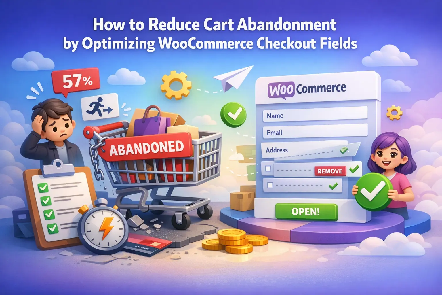
The frustrating truth is that by the time a customer reaches your checkout page, they have already made the decision to buy. Cart abandonment at checkout is almost never about the product or the price. It is about friction. Specifically, it is about checkout forms that ask too much, feel disorganized, or create confusion. Every unnecessary field, every unclear label, and every awkward moment of “why are they asking me this?” is a leak in your conversion funnel.
WooCommerce ships with a default checkout form that was built for the average store, which means it is optimized for no store in particular. The good news is that this is a solvable problem, and you do not need a developer or custom code to solve it. This guide walks through the specific changes that make the biggest difference, and shows you how a proper WooCommerce checkout field editor for higher conversions lets you implement all of them from a visual interface.
There is a large body of research on cart abandonment and the reasons are remarkably consistent across studies. The Baymard Institute, which has been tracking checkout behavior for over a decade, consistently finds that a long or complicated checkout process is one of the top two reasons customers give for leaving without completing their purchase. This is not a fringe behavior. It affects the majority of abandoned sessions.
The mechanism is straightforward. When a customer arrives at checkout, they are in a state of intent. They want to complete the transaction. Every friction point, every unexpected question, and every moment of confusion chips away at that intent. The further the form strays from what the customer considers reasonable, the more likely they are to rationalize a reason to delay the purchase. “I’ll come back later” almost always means never.
WooCommerce’s default checkout includes fields for company name, address line 2, phone number, and order notes, among others. For a customer buying a digital download or a single physical product with straightforward delivery, none of these fields add value. They add time, and they signal that the store has not thought carefully about who its customers are.
More than 60% of e-commerce traffic comes from mobile devices. On a small screen, a checkout form with a dozen fields stacked vertically becomes a scrolling marathon. Fields that appear in the wrong order for mobile users, or that require switching between keyboard types multiple times, create abandonment pressure that desktop users simply do not experience.
When a customer sees a field they do not understand or cannot connect to their purchase, trust takes a hit. “Why do they need my phone number for a digital product?” is a question that plants doubt. Default field labels like “Order notes” mean nothing to most buyers and only add visual clutter. Confusing forms feel unprofessional, and unprofessional stores do not get completed purchases.
WooCommerce’s default checkout was designed to be a starting point, not a finished product. It tries to accommodate the broadest possible range of store types, which means it includes fields that are relevant to some stores and irrelevant to most. If you have never customized your checkout fields, there is a very high probability your form is asking your customers for information you do not need.
Beyond unnecessary fields, the default WooCommerce checkout also has no mechanism for context-sensitivity. Every customer sees exactly the same form regardless of what they are buying, how they found the store, or what kind of customer they are. A first-time individual buyer and a returning business customer fill out identical forms, even though their needs are completely different. This one-size-fits-all approach is a conversion killer in stores with diverse customer types.
The highest-impact change most WooCommerce stores can make is also the simplest: remove the fields you do not need. This is not about creating a minimalist design for its own sake. It is about respecting your customer’s time and demonstrating that your checkout is tailored for them rather than built for a generic store that might sell anything.
The challenge with WooCommerce defaults is that removing or hiding fields normally requires PHP hooks and code changes that most store owners cannot make themselves. Every time WooCommerce updates, those hooks need to be checked for compatibility. It is a maintenance burden that creates technical debt. The right approach is a dedicated field editor that gives you a visual interface for these changes and maintains compatibility as WooCommerce evolves.
When evaluating which fields to disable, work through each one and ask a specific question: if this field were not here, would my ability to fulfill this order be materially affected? For most fields, the honest answer is no. You need a name, an email, a delivery address for physical goods, and payment information. Almost everything else is either a nice-to-have or a leftover from a template that was designed for a different kind of store.
One practical note: “disable” and “delete” are different. A well-built field editor lets you disable default WooCommerce fields so they are hidden from the checkout form but remain in the system if you ever need to re-enable them. This is safer than deleting, which may cause issues when WooCommerce expects certain fields to be present.
Field order matters more than most store owners realize, and it matters most on mobile. On a desktop screen, customers can scan the entire form at once and jump between fields non-linearly. On a mobile device, the form is experienced top to bottom, one field at a time. The order in which fields appear directly affects how natural the completion process feels.
The most conversion-friendly field order follows the mental sequence your customer uses. They think of themselves before they think of their address. They confirm their contact details before they commit to a location. A form that starts with the most personal, familiar fields (first name, last name, email) and moves progressively toward the more complex ones (full address, payment) feels more natural than one that front-loads the heaviest cognitive work.
Conditional logic is arguably the most powerful tool available for WooCommerce checkout optimization, and it is one that the default WooCommerce checkout does not support at all. Conditional logic means that certain fields only appear when specific conditions are met. A field that is irrelevant to the current customer is simply not shown.
Consider a store that sells to both individual consumers and businesses. Individual consumers have no use for a company name field, a VAT number field, or a purchase order reference. But business customers need all three. Without conditional logic, you have two bad choices: show the business fields to everyone (which clutters the form and confuses individual buyers) or hide them from everyone (which forces business customers to contact you separately). With conditional logic, you show a simple toggle or checkbox that says “I’m ordering for a business,” and the relevant fields appear only when that is selected.
A delivery instructions field is genuinely useful for physical goods (leave at the back door, call on arrival) but completely meaningless for digital downloads. With conditional logic tied to product type or shipping method, this field only appears when it is actually relevant. Digital buyers see a cleaner form; physical delivery customers see a field that is directly useful to them.
Rather than adding gift wrapping fields to every checkout, a checkbox labeled “This is a gift” can trigger the appearance of a gift message field, a gift wrapping selection, and an alternative delivery name. Customers who are not buying gifts are not interrupted by these options. Customers who are buying gifts find exactly what they need without having to search for it.
Different countries have different address conventions. Some require a state or province, some do not. Some use postal codes, some use different postal systems entirely. Conditional logic that adjusts which fields are shown or required based on the selected country creates a checkout that feels locally appropriate rather than exported from a foreign template.
Optimization is not only about removing fields. There are cases where adding the right field at the right moment increases conversions rather than harming them. The key distinction is between fields that serve the customer and fields that serve only the store.
Fields that help customers get exactly what they want, or that solve a genuine uncertainty they have, reduce hesitation rather than creating it. A preferred delivery time selection (morning, afternoon, evening) gives customers confidence that their delivery will fit their schedule, which removes a reason to delay. A gift message field makes the checkout feel personalized. A clear “How did you hear about us” dropdown that is optional and brief feels like a conversation, not surveillance.
The test for any field you are considering adding is simple: does completing this field give the customer something they value, or does it only give the store something it wants? Fields that pass this test tend to be completed willingly. Fields that fail it tend to be resented or abandoned.
One of the most underused capabilities in advanced WooCommerce checkout management is the ability to assign custom fields to specific products rather than applying them globally across the entire store. This is a significant departure from the default WooCommerce approach, and it is where checkout optimization starts to feel genuinely tailored rather than just cleaner.
Imagine a store that sells both custom-engraved jewelry and standard accessories. For the engraved pieces, collecting the engraving text at checkout is essential to fulfilling the order. For the standard accessories, that field is irrelevant and would only confuse buyers. Per-product field assignment means the engraving text field appears automatically when a customer has an engravable product in their cart, and disappears when they do not.
This level of precision is impossible with WooCommerce’s default checkout and difficult to implement manually with code. The WooCommerce checkout field editor with per-product field assignment treats this as a standard feature, configurable from the product settings screen without any developer involvement.
If you are running a more recent WooCommerce setup, there is a good chance your checkout page is built using WooCommerce Blocks rather than the legacy shortcode-based checkout. This matters because many field editor plugins were built for the legacy checkout and do not work correctly with the Blocks-based checkout.
When choosing a checkout field editor, confirm that it explicitly supports WooCommerce Blocks. A plugin that only works with the legacy checkout will require you to maintain a shortcode-based checkout, which limits your ability to use other modern WooCommerce features and creates a compatibility ceiling as WooCommerce continues to develop the Blocks checkout as its primary supported implementation.
Cart abandonment at checkout is a real and fixable problem. The changes required are not technically complex, but they do require deliberate attention to your specific customers and their needs. Here is a practical summary of what to audit and what to change.
Cart abandonment is a metric that most WooCommerce store owners watch but many treat as a fixed cost of doing business. It is not. The checkout form is a variable you control, and the changes required to meaningfully reduce abandonment are well within reach for any store owner who is willing to look at the checkout experience through the customer’s eyes.
The Advanced WooCommerce Checkout Field Editor plugin with conditional logic and per-product fields gives you the technical tools to implement every change described in this guide without writing a line of code. The strategic thinking about which fields to keep, which to remove, and which to make conditional is yours to apply. Start with the fields you know you do not need, then work toward the conditional logic that makes your form feel tailored. You will see the results in your conversion data.
Advanced WooCommerce Checkout Field Editor gives you drag-and-drop field control, conditional logic, per-product fields, and full WooCommerce Blocks support — everything you need to build a checkout your customers actually complete.








Does this work for subscription products as well?
Didn't realize my checkout form was scaring people off.
Hey guys, just had to leave a quick review for this checkout optimization guide. bought it as a gift for my buddy who runs an online store, and wow turns out his cart abandonment was exactly the issue.