Next-Level Code. Nexuvibe Style ...
Hrs
Min
Sec

I watched a user test session where someone spent three minutes looking for help on a WordPress site. The chatbot was right there in the corner the entire time. They never saw it. The icon blended into the site’s busy footer. The color matched the background. No welcome message appeared. The user eventually gave up and left. The chatbot might as well not have existed.
This happens more often than site owners realize. You invest in AI capabilities, configure your knowledge base perfectly, craft ideal responses—then lose everything because the chatbot widget is invisible, appears at the wrong moment, or looks so generic that users assume it is spam. User experience decisions determine whether your chatbot investment pays off or disappears into the background.
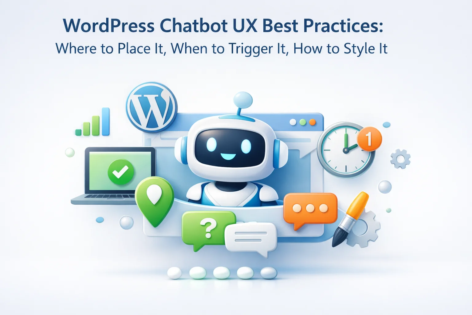
This guide covers the specific UX decisions that affect chatbot engagement: where to position the widget, when and how to trigger it, and how to style it for your brand. These decisions apply to any WordPress AI chatbot implementation, and getting them right often matters more than the AI quality underneath.
Widget placement affects visibility and perceived intrusiveness. The standard bottom-right corner exists for a reason, but it is not always the best choice for every site.
Users expect chat widgets here. Eye-tracking studies show this corner gets natural attention without blocking content. It works well for e-commerce, service sites, and most WordPress installations. This is the safe default choice that works for 80% of sites.
Use this when the bottom-right has conflicts: cookie consent banners, floating cart buttons, or other widgets already occupy that space. Left placement is less expected but still visible. Better to be visible on the left than hidden behind overlapping elements on the right.
On contact or support pages, consider embedding the chatbot directly into the page content rather than using a floating widget. This makes it the primary support option rather than an afterthought. Users on these pages are already looking for help—make the chatbot unmissable.
Timing affects both engagement and annoyance. A chatbot that pops open immediately feels intrusive. One that never proactively appears gets overlooked. Finding the balance requires understanding user behavior on your specific site.
The first message users see shapes their expectation of the entire interaction. Generic greetings get ignored. Specific, helpful openings encourage engagement.
This says nothing. It does not tell users what the chatbot can do, does not feel personalized, and sounds like every other chatbot they have ignored. Users do not know if this can actually help them or if it is just another frustrating bot.
This tells users exactly what the chatbot handles. It sets expectations and gives confidence that asking about these topics will get useful answers. Users immediately know whether this chatbot is relevant to their needs.
When the chatbot knows which page the user is on, it can offer relevant help. On a pricing page, offer pricing explanations. On a product page, offer product information. This feels helpful rather than intrusive because it addresses likely questions.
A chatbot that looks like it belongs on your site gets more engagement than one that looks like a generic third-party widget. Visual consistency builds trust and reduces the “spam bot” perception that kills interaction rates.
Use your brand’s primary color for the chat header and send button. Choose a contrasting color for the widget icon so it stands out. Avoid pure black or white backgrounds—they look harsh. Soft, brand-aligned colors feel intentional rather than default.
Use a custom avatar that matches your brand personality. A friendly illustration works better than a generic robot icon. Some brands use a stylized version of their logo. Others create a character specifically for the chatbot. Avoid stock images of humans—they feel deceptive for AI.
If your chatbot plugin allows custom fonts, use the same font family as your site. Consistent typography creates visual harmony. At minimum, ensure font sizes are readable on all devices—14-16px minimum for chat messages.
The widget icon should be large enough to see (48-60px minimum) but not so large it dominates the screen. Rounded corners feel friendlier than sharp edges. The open chat window should be wide enough for comfortable reading (320-400px) without covering too much content.
More than half of web traffic is mobile. A chatbot that works beautifully on desktop but fails on mobile loses half its potential value. Mobile UX requires specific attention.
When the chatbot opens on mobile, it should take the full screen. Tiny chat windows floating over mobile content are unusable. Full-screen provides proper keyboard space, readable text, and focused interaction.
Any buttons or quick replies need to be large enough for finger taps—minimum 44×44 pixels. Space them apart to prevent accidental taps. Quick reply suggestions are especially useful on mobile where typing is slower.
Users must be able to easily close the chat and return to browsing. A prominent X button or swipe-to-close gesture is essential. Nothing frustrates mobile users more than feeling trapped in a chat they cannot exit.
On mobile, the bottom of the screen often has navigation bars or gesture zones. Position your widget slightly above the absolute bottom to avoid conflicts. Test on actual mobile devices, not just browser simulators.
Avoid these patterns that consistently reduce chatbot usage and frustrate visitors.
Unexpected sounds startle users and get your tab immediately muted or closed. Never play sounds unless the user has explicitly opted in. The surprise “ping” of a chat opening is universally hated.
If a user closes the chat, respect that decision. Do not automatically reopen it after a few seconds or on the next page. This behavior feels aggressive and disrespectful of user choice. Once closed, stay closed until the user chooses to reopen.
Asking for name and email before letting users ask a question creates friction. Let them chat first. If you need contact info, ask after you have provided value. Leading with a form feels like a data grab, not helpful service.
A chatbot icon that matches the background color, is too small, or hides behind other elements defeats the purpose. If users cannot find it, it does not exist. Ensure sufficient contrast and visibility without being obnoxiously large.
UX decisions are hypotheses until you test them. What works for one site may not work for another. Track chatbot engagement rates, monitor where users click to open the chat, and watch for patterns in when conversations start. Use this data to refine your placement, timing, and styling over time.
SmartChat Assistant provides the customization controls you need to implement these UX best practices: flexible positioning, trigger timing options, visual customization, and mobile-optimized design. Start with the defaults based on this guide, then refine based on what your specific audience responds to.
SmartChat Assistant gives you complete control over positioning, timing, colors, and styling. Create a chatbot experience that feels native to your WordPress site.






I've run social media for brands where we'd spend months training chatbots, only to realize users totally ignored them. this guide finally clicked for me it's not just about having AI, it's about how and when you show it. That part about the chat icon getting lost in a cluttered footer? Yeah, that was us.
I bought this guide hoping to fix my site's chatbot visibility issues, and it did help just not as much as I'd hoped. The visual styling section was actually really solid, with clear examples of how to make the widget pop without looking out of place.
Just finished reading through this guide, and wow that example about the user missing the chatbot for three minutes really hit home. Never realized how easy it is to overlook something so simple. Great stuff!